These 19 palettes run from butter yellow and cornflower blue spring pairings to deep burgundy and gold winter drama, with the deciding factor being what your venue already owns: its stone, carpet, or the hour of daylight when guests arrive.
I start every palette search with the venue itself, because terracotta tile does half the work for you while beige ballroom carpet forces every decision uphill.
1. Color Palette Based on Venue
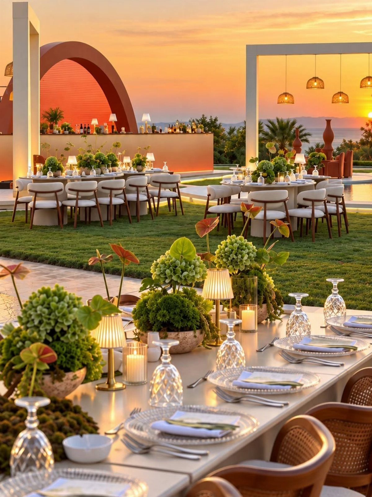
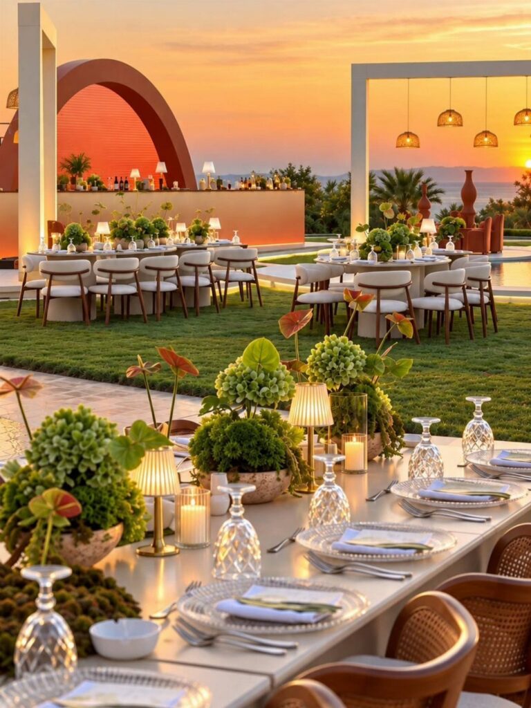
Terracotta arches pull their weight best when the surrounding colors stay low and warm, letting the architecture read as the statement rather than competing with it.
Pulling from what is already there, stone, sea, lawn, saves money on draping and flowers that fight the view.
I start with the dominant tone, the warm clay or the green lawn, then add two companions, not five.
The free palette tools at weddingdecor.com let you test each color against a photo of your actual space, which matters more than any trend board.
Spring pastels read fresh against new grass; winter navy velvet suits a stone courtyard after dark.
One limit: indoor venues with beige carpet give you less to work with, and more to cover.
2. Burgundy and Gold Wedding Palette
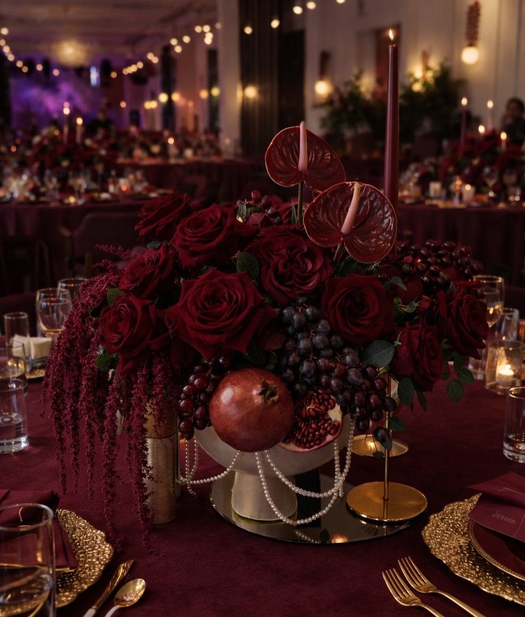
Velvet tablecloths catch candlelight in a way linen never will. Deep burgundy against gold flatware sets the tone; pomegranates and grapes do double duty as color and edible decor.
This palette needs dim light to work. In a bright afternoon tent, the burgundy flattens to basic red and the gold turns brassy.
Move it indoors after sunset, or tent the windows. The dusty rose in the mix is not a main player; use it in small doses, ribbon on programs, a wash in the stationery, so the depth stays deep.
Winter weddings get this free from the season. Summer brides wanting the same mood will spend more on fabric weight and lighting to keep it from looking like a Christmas party.
3. Dusty Rose and Sage Wedding Palette
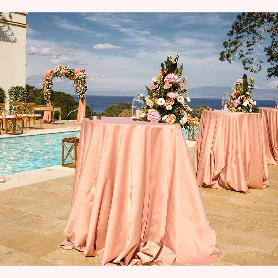
Poolside dusty rose reads differently than it would in a ballroom; the water reflects it cooler, the stone warms it back up. That tension is what keeps this palette from going too sweet.
Sage handles the greenery so you spend less on flowers.
I have seen brides use seeded eucalyptus, olive branches, even fresh herbs from the garden, and the palette still holds. The warm taupe belongs in linens and suits, a grounding color that keeps the pink from floating away.
This one travels well across seasons. The same colors in April with peonies and in September with dahlias feel like 2 different weddings, which is useful if your date shifts.
4. Blush and Champagne Wedding Palette
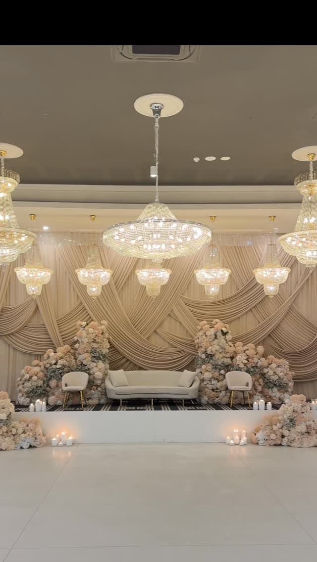
Champagne fabric under chandeliers does the lighting designer’s job for them. Petal blush and warm blush are close enough to read as one color from a distance, which means you can mix bridesmaid dress shades without a clash.
The pearl and rose gold sit best in small metal details: flatware, candleholders, the thin frame of a mirror table number.
Too much rose gold and the whole room turns pink; I would keep it to accents only, a runner here or a votive there.
This palette suits venues with some existing warmth, wood floors, gilt frames, cream walls. In a raw industrial space it can look washed out unless you add heavy texture, velvet, silk, thick florals, to give it body.
5. Dusty Blue and Ivory Wedding Palette
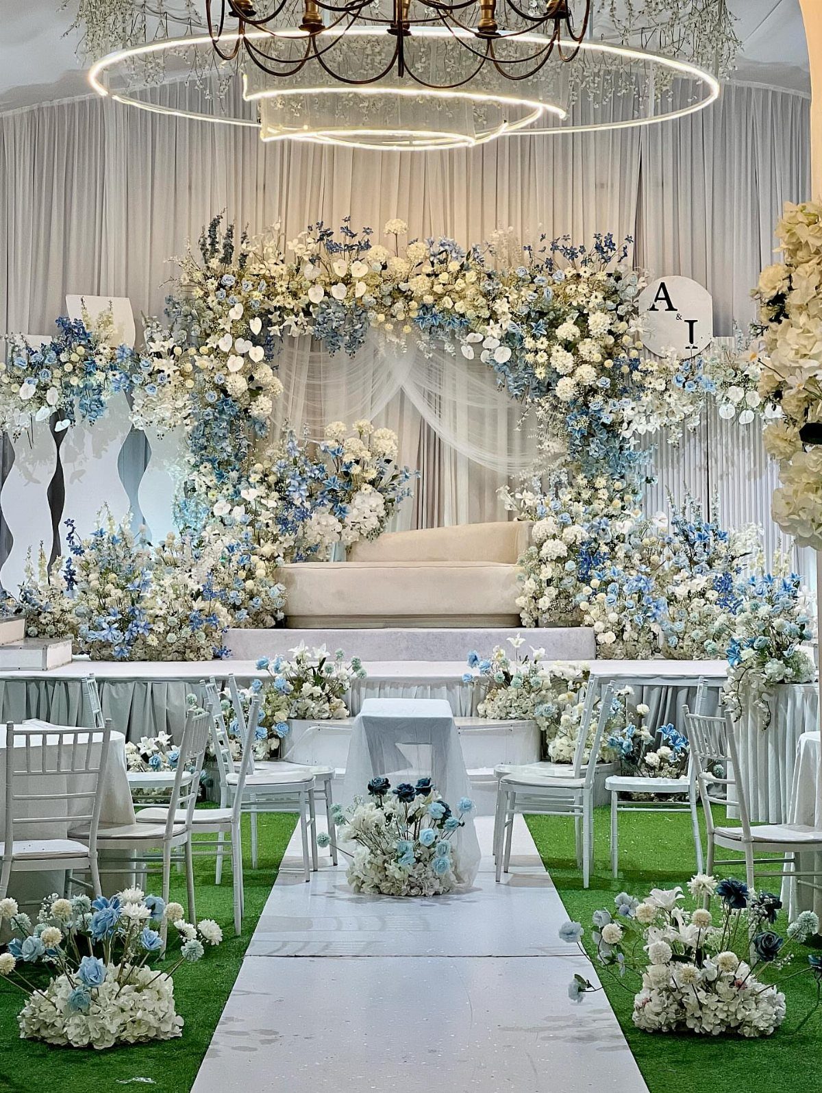
Dusty blue against white chairs is calm without being cold, which is harder than it looks. The silver sage in this mix is the bridge color; use it in greenery or linen to keep the blue from turning nursery-bright.
Winter weddings can pull this off with heavier fabrics, velvet or thick wool in the blue, and warm ivory instead of stark white.
The sky mist is your wall color or your stationery wash, a step lighter than the main blue so the eye moves through the space.
I would watch the metal finish.
Silver keeps it cool and coastal; gold warms it toward something else entirely. Pick one and stay consistent, flatware to frames to the thin edge of a vase.
6. Sage and White Wedding Palette
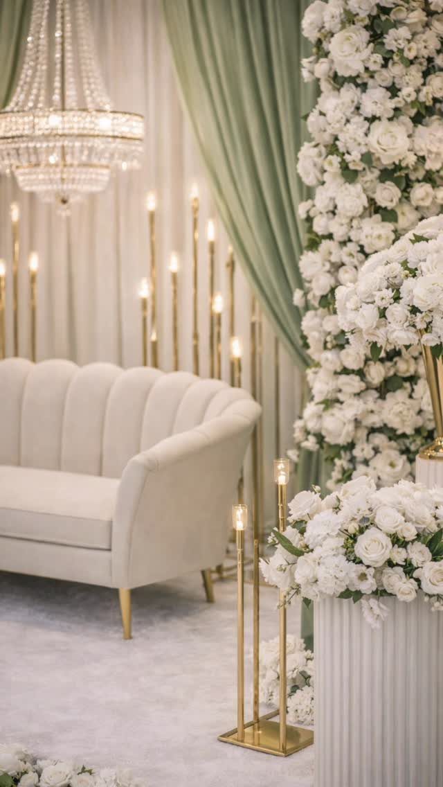
Sage drapery against cream velvet is English garden translated indoors. The muted green and pale moss let you use different greens in the florals without demanding an exact match, which saves money and looks more natural anyway.
The soft white belongs in the flowers and the plates; the warm cream in the furniture and linens.
That separation keeps the room from going flat. Gold candleholders add the only bright metal, and they work because there is so little competing shine.
This palette needs scale to work.
In a small room the drapery overwhelms; in a tall space with nothing above eye level it looks stranded. Check your ceiling height before you commit to hanging fabric.
7. Emerald and Gold Wedding Palette
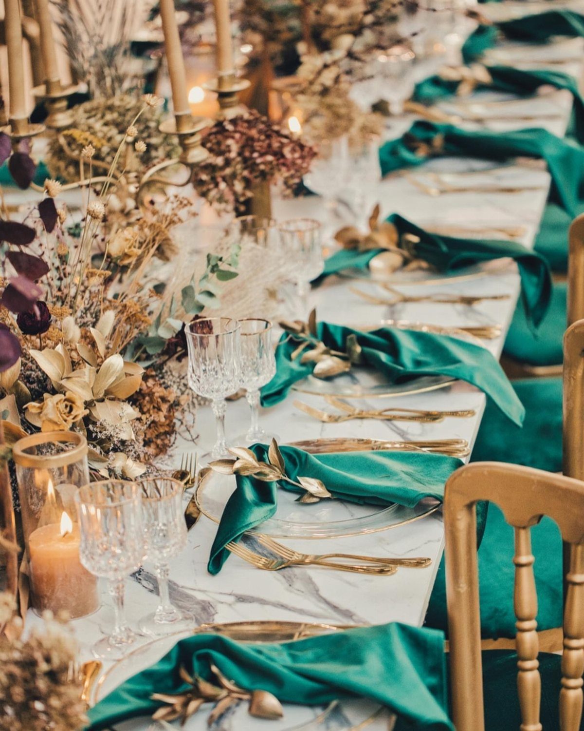
Emerald velvet against antique gold reads richer than forest green because the blue undertone catches light instead of absorbing it.
Deep forest works as the shadow color, in drapery or suits, while champagne and ivory keep the table from going too dark.
This palette belongs in fall and winter, when candlelight is expected and heavy fabric makes sense.
Summer brides pay more for air conditioning and lighter weaves that still carry the same depth. The gold here is antique, not bright; match it to old brass candleholders and skip anything polished.
8. Olive Green Bridesmaid Dresses
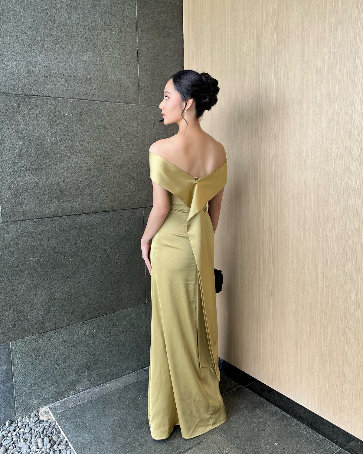
Olive green satin carries an earth tone without the predictability of sage. The undertone is warmer, closer to dried grass than new leaf, which means it suits September when the light is still high but the air has turned.
White and tan floral arrangements keep the look grounded; anything brighter fights the dress.
I would put the bridesmaids against stone or raw wood, not pastels or gilt. An off-the-shoulder cut works in this shade because the color is doing enough; a busier neckline would compete.
9. Sea Glass Bridesmaid Dresses
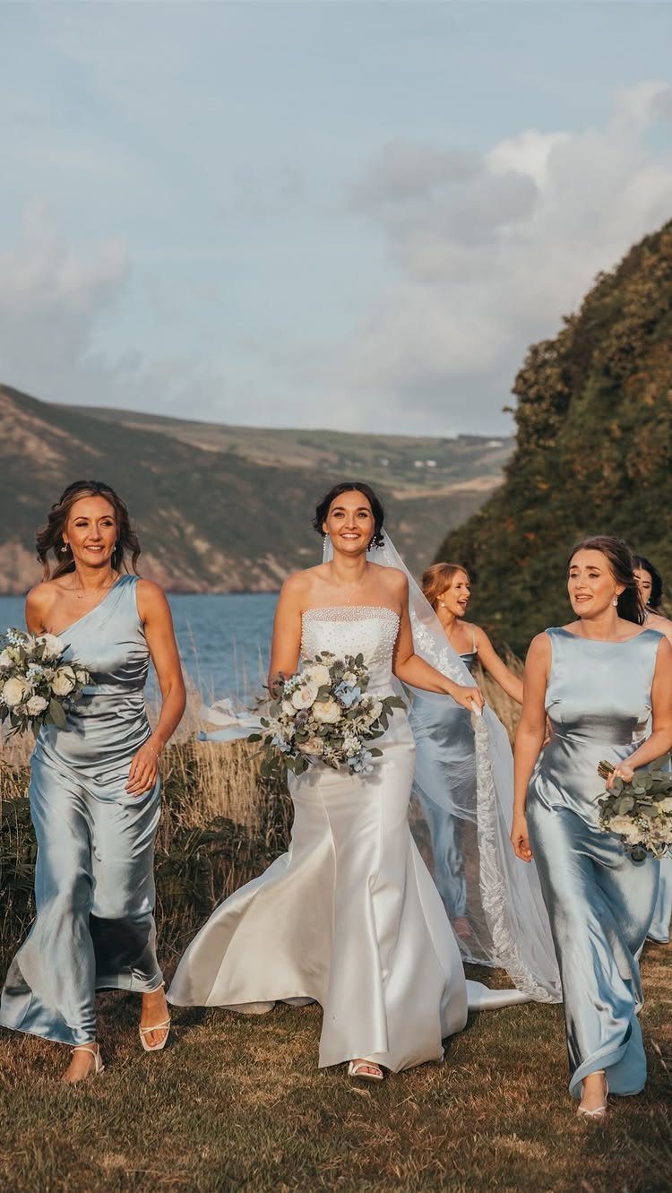
Sea glass sits between blue and green by a hair, enough that it shifts in outdoor light from coastal mist to something warmer. That instability is the point; it keeps the color from reading as a decision already made.
For a waterfront wedding, the dress and the water argue pleasantly without matching.
Inland, the same color needs white accents in the bouquet and the stationery to keep it from going muddy. Satin in this shade reflects sky differently than chiffon would; the heavier fabric holds the color steady in bright sun.
10. Gold Satin Bridesmaid Dresses
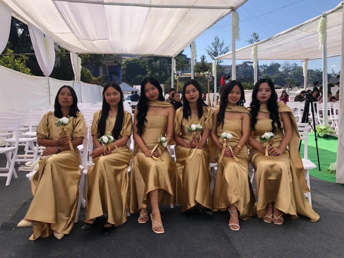
Gold satin asks for restraint everywhere else. The dress is the metallic accent; add more to the table or the invitations and the room turns to brass.
White bouquets keep the line clean against gold satin. I would extend that discipline to the groomsmen, charcoal or midnight blue, never competing metal.
The subtle shade matters: too yellow and it is costume, too pale and it is beige with ambition. Kennedy Blue calls this one satin gold, which sits in the narrow middle.
11. Mood Setting with Colors
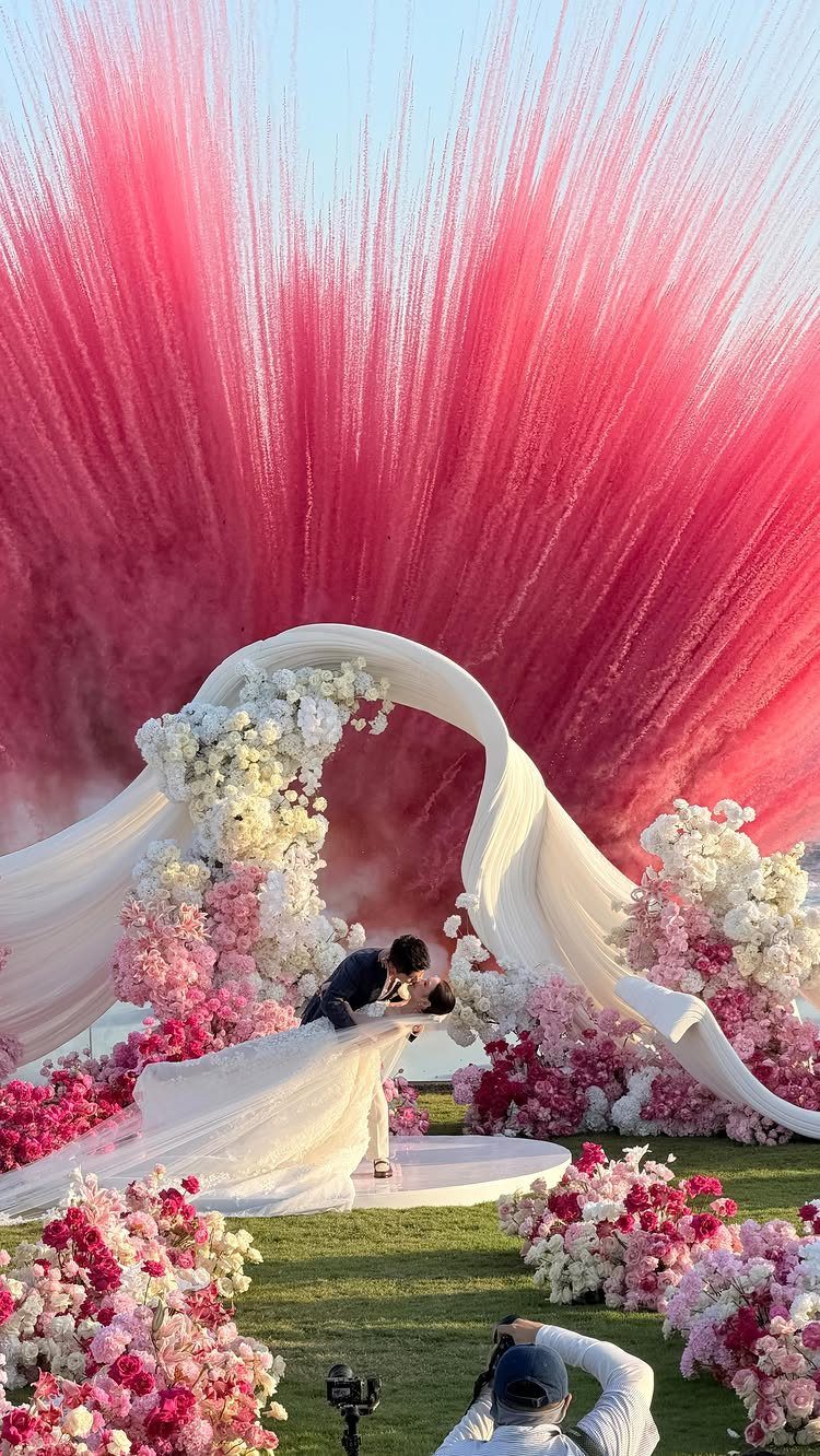
A pink smoke bomb behind white florals is not subtle, and it is not trying to be. The color sets the mood before anyone reaches the bar.
Bright colors signal permission to celebrate loudly; muted ones let guests relax into elegance. The choice is not which is prettier but which job you need done.
I would decide this before picking a single swatch, because the palette follows the mood, not the reverse. A free mood board at weddingdecor.com tests the feeling once you have the colors gathered.
Dark shades add drama, though they eat light; budget for more candles or a better photographer.
12. Teal Wedding Colors for a Pop
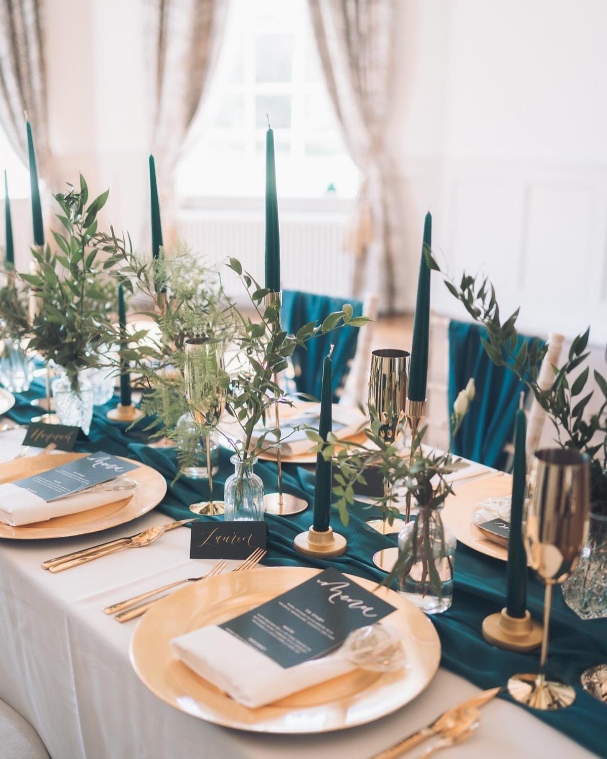
Teal runners and taper candles against gold chargers give you the pop without painting the walls. The rest of the table stays white and neutral, letting the color move where the eye travels.
This suits brides who want vividness in the wedding party and bouquets without committing the whole room.
Teal reads one way at a coastal wedding and another inland, where it shifts toward jewel tone in formal light. Decide which version you are building before you order the dye.
13. Glamorous & Elegant Boho
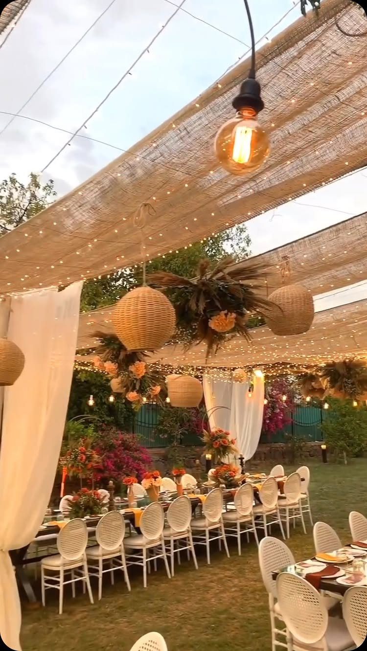
Burlap canopy and Edison bulbs give you the structure; the color choice decides whether this reads relaxed or dressed up. Sandy beige and wood tones keep it casual; emerald green or terracotta push it toward evening elegance.
I would check the light first. Fairy strings read magical after sunset and invisible by four in the afternoon; plan the ceremony time before you order the wattage.
Black accents in flatware or candleholders sharpen the look without losing the boho looseness, though too much kills the warmth.
14. Warm Brown Wedding Shades
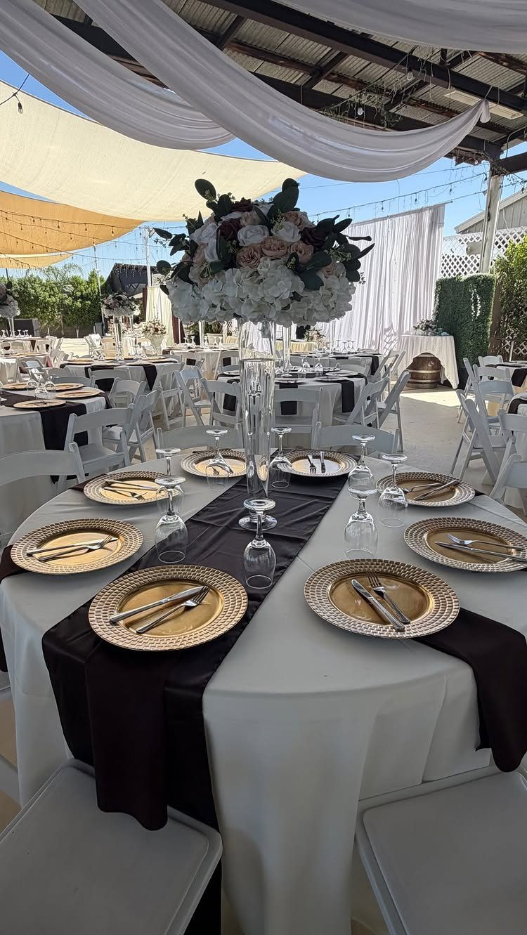
Dark brown satin against white linen is the muted sunset in fabric form. The gold chargers catch what light remains and keep the table from sinking into earth tone alone.
This palette needs natural light to read romantic rather than muddy.
An indoor ballroom at noon will flatten it; an outdoor reception as the sun drops gives you the glow the color promises. Tall centerpieces with height variation keep the eye moving across a table that otherwise risks heaviness.
Check your venue walls. Beige or cream supports this; gray fights it.
15. Tropical Vibes
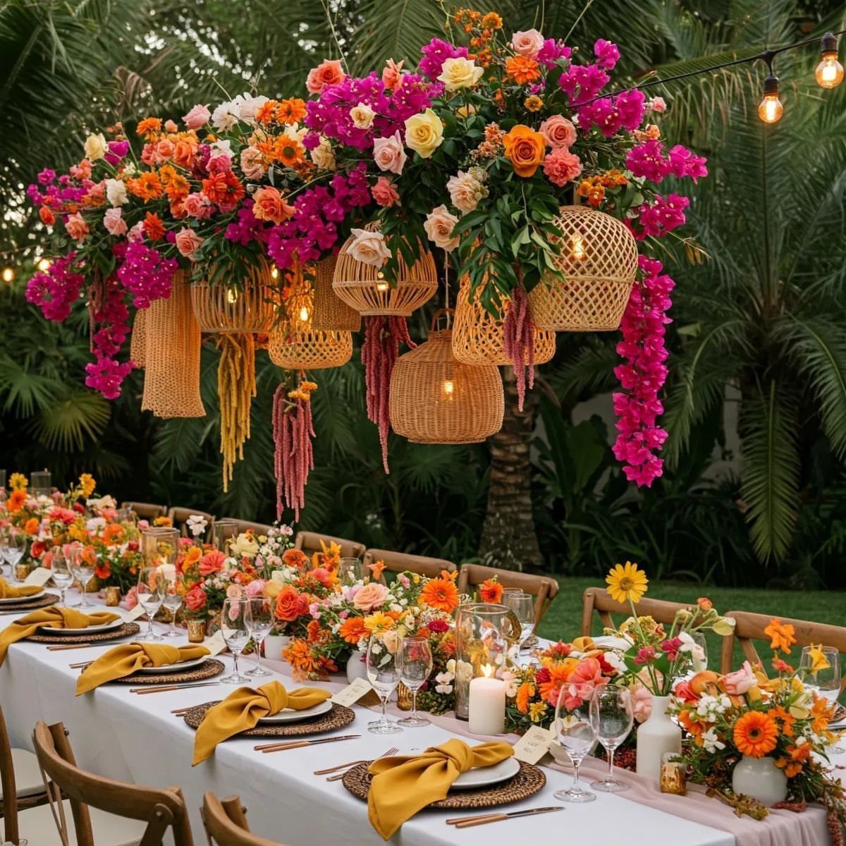
Bring in yellow napkins and pink-orange blooms against palm fronds if you want a tropical palette that announces itself. This is the palette for couples who want their wedding to feel like a vacation already in progress.
White linens stay necessary; anything darker and the bright tones look accidental rather than chosen.
Destination weddings get this free from the landscape. At home, you are importing the feeling with every stem and dyed napkin, which costs more than muted alternatives.
16. Butter and Blue Wedding Palette
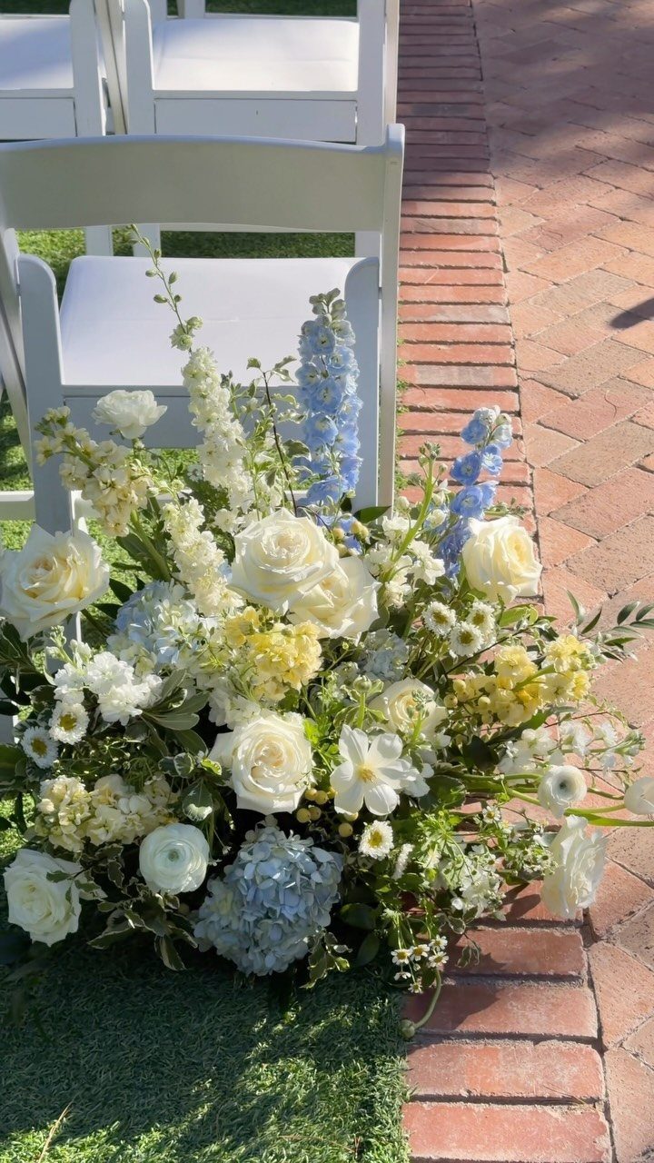
Butter yellow and cornflower blue together read as spring even in other seasons, which is useful if your date shifts. Sage bridesmaid dresses handle the greenery visually, which means fewer out-of-season stems in the bouquet budget.
Ivory belongs in the linens and the larger blooms; champagne in the metal details and the smaller accents.
That separation keeps the yellow from turning the whole table into a nursery. I would keep the blue to the flowers and the bridesmaid accessories, not the main dress, where it can read costume against pale skin.
This one needs sunlight. In a dim church, the butter yellow turns mustard and the blue goes gray.
17. Burnt Orange Bridesmaid Dresses
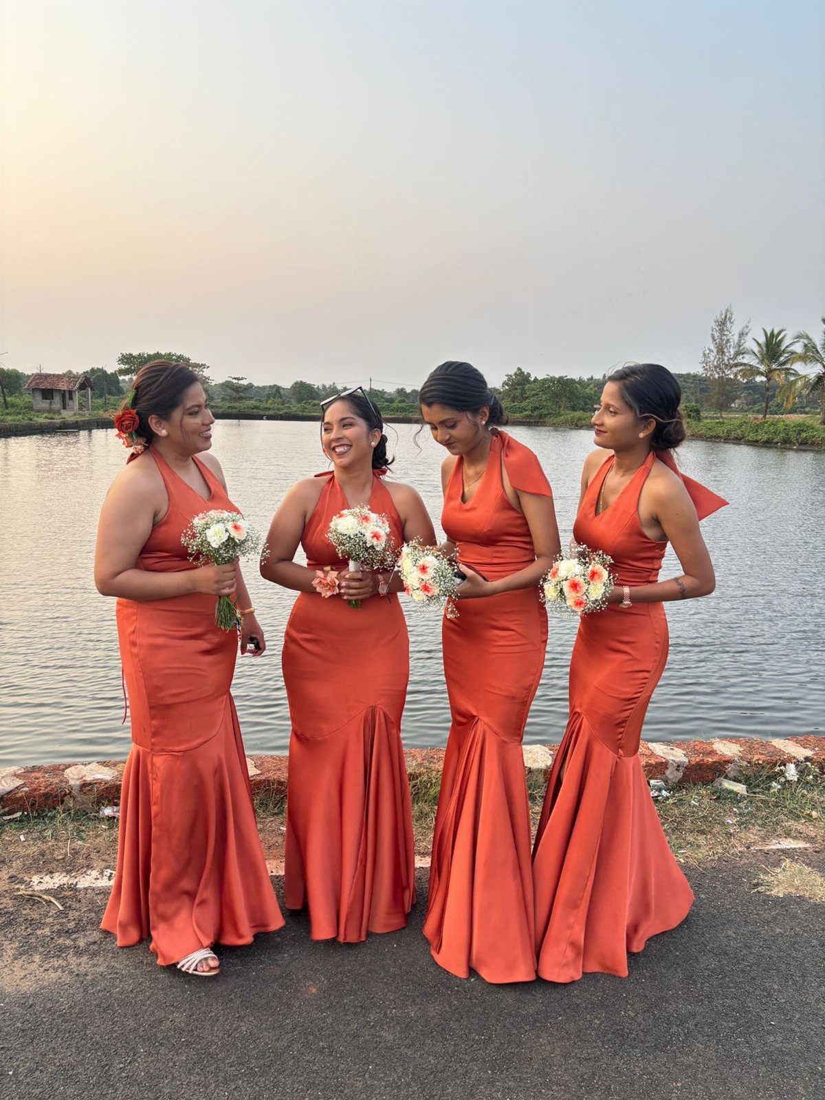
Burnt orange satin at sunset catches the last light and throws it back warmer than the sky. The halter cut keeps the neckline clean because the color is doing the work; anything busier competes with the glow.
Peach and white bouquets keep the bridesmaids from looking like autumn foliage themselves.
Navy groomsmen suits ground the palette without the cliché of black. The satin weight matters here: lightweight chiffon in this shade goes pumpkin, while heavier fabric holds the depth.
This is a fall palette that knows it. Summer brides wanting the same warmth will fight the season.
18. Emerald Green Bridesmaid Dresses
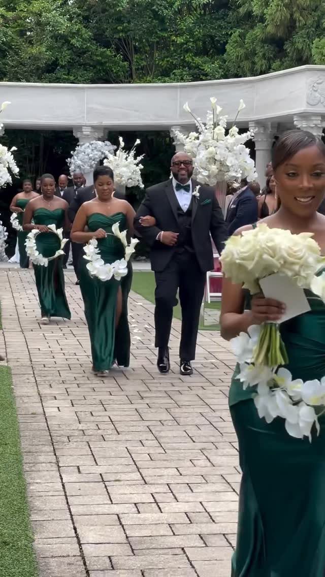
Strapless emerald satin against white floral hoops gives you the contrast without the formality of black. The green reads jewel tone in shade and garden in sunlight, which is a narrow balance to hold.
White bouquets are essential; cream turns the pairing muddy in photographs. Emerald green reads brighter and almost Christmas against grass or carpet; set it against stone or raw wood and the blue undertone comes forward.
I would keep bridesmaid jewelry minimal.
Gold sits well with emerald because the metal picks up that faint brass note; silver throws everything toward navy and away from the green itself. Small pearl studs and nothing at the throat.
19. Classic White and Gold Ballroom
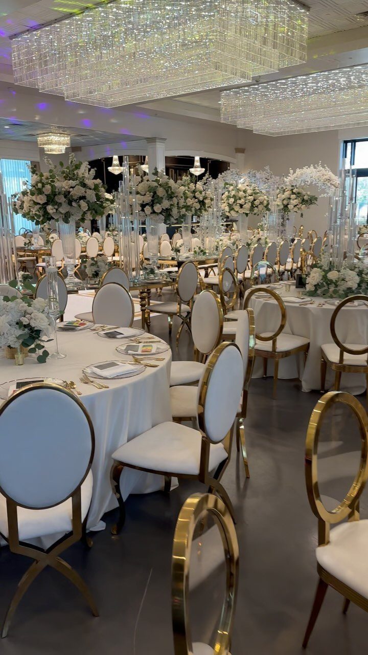
Crystal chandeliers over round tables do the heavy lifting in a ballroom; the white and gold just stays out of their way.
This palette suits venues that already own the drama. If your space has low ceilings or fluorescent fixtures, white and gold turns spare instead of grand.
I would check the chair style before committing: chiavari gold reads formal, while cross-back wood with gold pads leans rustic against the same linen.
Warm neutrals in the place cards or menu cards keep the white from reading sterile; the hex F2E9DC is a soft cream that bridges the 2 tones without adding another color to manage.
Beige groomsmen suits extend that warmth, though midnight blue works if you want sharper contrast.
The risk here is uniformity.
Every table identical, every centerpiece the same height, and the room becomes a hotel conference setup. Vary the floral height slightly table to table, or add one low arrangement with gold candleholders for the break.
Choosing Colors Based on Venue
The carpet, the chairs, the stone outside the window: these are your starting colors whether you chose them or not. I look at the floor first, since it covers the most surface and is usually the hardest to change.
Beige carpet in a hotel ballroom gives you almost nothing to build on, so you will spend more on draping and uplighting to create any atmosphere at all.
Terracotta tile in a Spanish Revival space does half the work for you; your job is to stay out of its way with colors that warm rather than compete.
Book the site visit for the same time of day as your ceremony. Lightner Museum’s white interior reads elegant at noon and ghostly by eight; the same is true of any space with big windows or strong architectural color.
Take a photo of the wall behind where you will stand, the table linens already in storage, the wood tone of the floor.
One color pulled from what is already there, two companions, and you are done. Every additional shade is another decision and another rental charge.
Mixing and Matching Colors
A five-color palette sounds generous until you realize five colors at full strength makes every table look like a fruit stand.
I build from one color that is already fixed, the bridesmaid dress or the venue wall, then add a lead companion and three accents that show up only in small doses.
The screen lies.
What reads as sage green on my monitor printed cooler on cotton napkin samples and warmer under Edison bulbs in the rental warehouse. Order physical samples of anything that will repeat: invitations, ribbon, linen, one bridesmaid swatch.
Lay them out under the light you will actually have, afternoon window or candle or overhead fluorescents, and watch them for a full day if you can.
The same navy goes almost black by eight pm and washed-out by noon; you want to know which version your guests will see.
One or two colors lead, the rest stay small, and every material gets tested where it will live.
Timeless Color Choices
Trend colors have a half-life. Pantone’s pick of the year is already everywhere by the time the ink dries, which means your wedding photographs will date themselves to that season whether you want them to or not.
I keep at least one color in every palette neutral and widely available: white, ivory, champagne, soft cream hex F2E9DC.
When the rental company is out of your exact sage in August, you can swap to the neutral without starting over.
Neutral palettes do not read as safe; they read as legible in photographs for the decades you will be looking at them.
Sage, dusty blue, champagne metallic on cream: these pairings have been working since before the current trend cycle and will keep working after.
Texture is what makes these stick. A neutral room with flat linen and no variation in finish reads institutional, not timeless.
Velvet, silk, thick florals, the slight irregularity of hand-pressed paper: these give a quiet palette the body it needs to hold attention. At least one neutral, tested in the actual light, with enough texture to keep it from going flat.
Frequently Asked Questions
What is the best color theme for a wedding?
There is no single best color theme; the right choice depends on your venue, the season, and the mood you want guests to feel.
Some themes practically select themselves, like orange and gold for a Halloween wedding or black and gold for a Gatsby setting.
I would start with what is fixed, the stone courtyard or the bridesmaid dresses already ordered, and build from there rather than chasing a trend.
What are the trendy colors for weddings in 2026?
Monochromatic layering is the biggest direction for 2026, built from greens, blues, or warm terracotta tones with multiple shades and textures in one family.
WeddingDecor.com’s 2027 mood boards show continued interest in blush, champagne, sage, warm neutrals, and burgundy. I notice couples are also mixing bridesmaid dress colors within a palette rather than matching exactly.
How many colors should a wedding color palette have?
Three to five colors is the useful range: one dominant tone pulled from something already fixed in your day, a lead companion, and two or three accents that show up only in small doses.
How do I choose wedding colors that work with my venue?
The venue hands you a starter palette the minute you walk in: that limestone fireplace, the walnut floors, the steel window frames, the exact blue of the upholstered chairs. Work with them or pay to hide them.
Some spaces do the heavy lifting. A floor of aged terracotta already carries warmth and history; beige wall-to-wall carries nothing and swallows your budget trying to compensate.
Schedule your walkthrough when the guests will actually be there. The same ivory reads yellow at 4 p.m. and turns moody and rich under votives after dark.
Can I share HEX codes with my wedding vendors?
I send HEX codes to vendors as a starting point, then warn them: that same number on a linen napkin, a glossy invitation, and a bare Edison filament will produce 3 different colors, none of them what the screen promised.
My final step is always a physical board: the printed invitation, the ribbon spool, the linen square, one fabric swatch from the bridesmaid dress, all pinned together and viewed under the venue’s actual lighting.