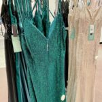
The right wedding guest dress color depends on what else is in your closet, whether the ceremony starts while the sun is still up, and how much the bride’s family tends to photograph the crowd; these 10 give you options for every scenario.
These 10 range from charcoal grey crepe that soaks up light to gold metallic that throws it back, each one matched to a fabric that does exactly what the color needs.
1. Sapphire Blue
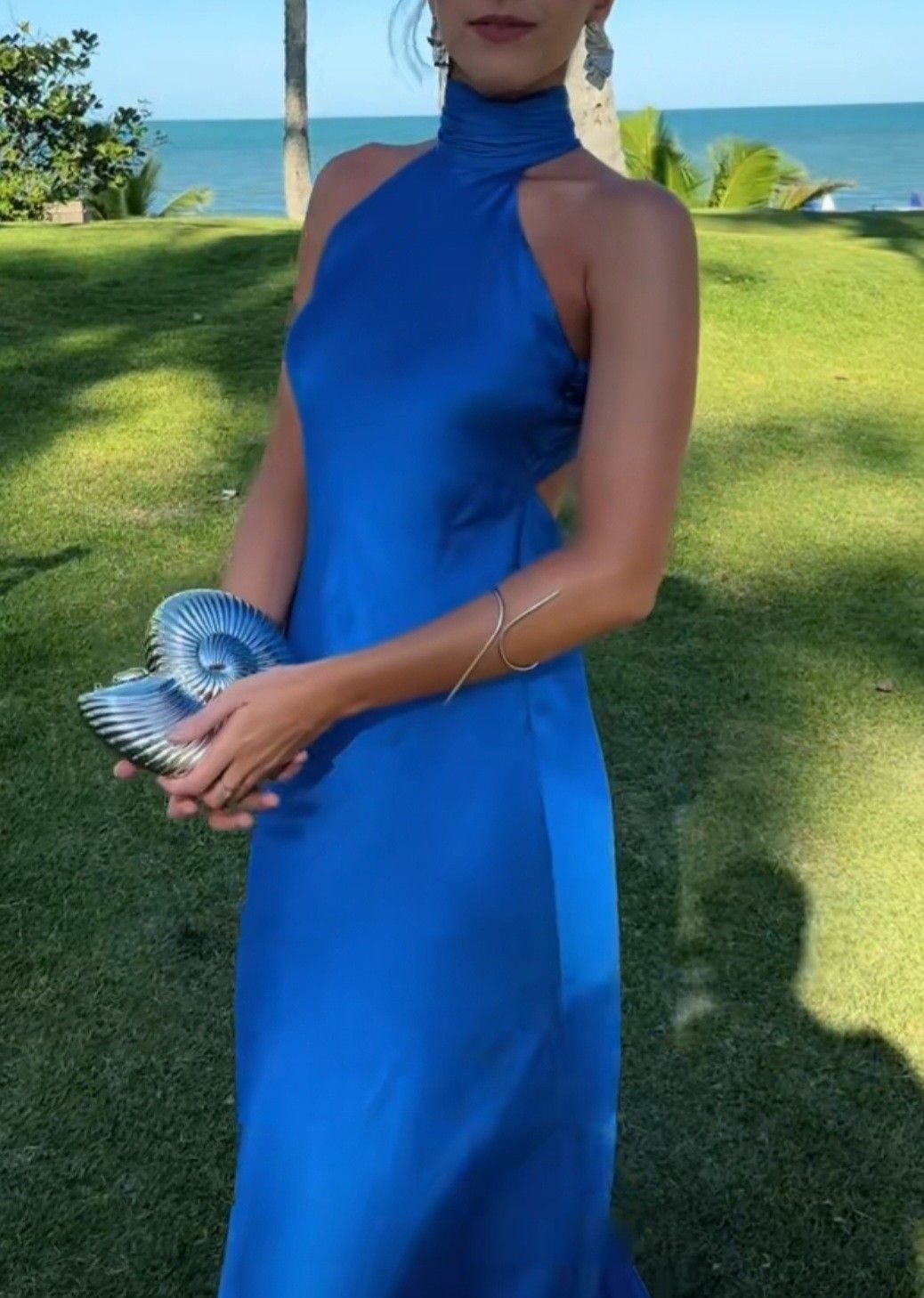
Sapphire blue carries the saturation that makes a statement without shouting. I look for this tone in satin or silk when the invitation says semi-formal or black-tie; the fabric catches light in a way matte crepe never manages.
Silver accessories settle the brightness rather than competing with it.
A clutch in brushed metal, small earrings, and I stop there. The color does enough work on its own.
I have worn this to evening weddings on the coast where the sky darkens toward the same shade.
It photographs clean and reads expensive at any distance, which matters when you are seated across a tent from people you have not met.
2. Ruby Red Silk
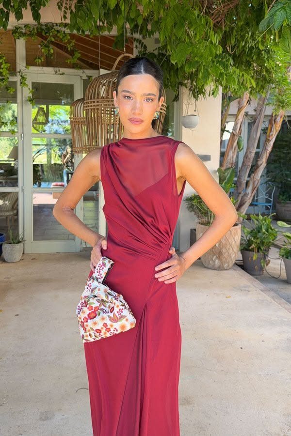
Ruby red reads romantic until the fabric goes cheap, and then it reads costume. I stick with silk or heavy satin, something that pools rather than clings, and I check the reverse side in daylight before committing.
A draped cut keeps the color from going pageant. A floral clutch, something soft against the red, breaks the intensity enough for a garden ceremony but still holds up in a ballroom.
This is the color I reach for when the wedding falls near a holiday and the whole season has already turned festive. It needs a confident lip color or none at all; the middle ground looks undecided.
3. Burgundy
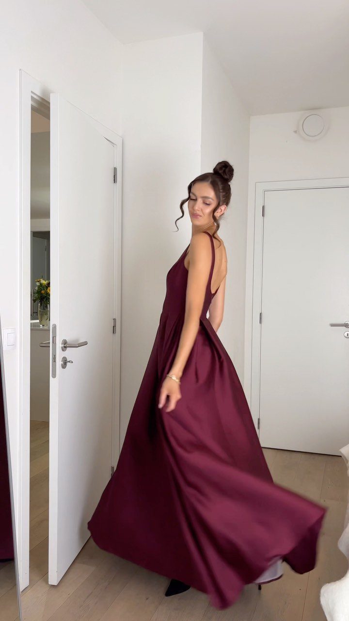
Burgundy has the depth to flatter every skin tone I have seen it on, which is rarer than color charts promise. The brown-purple undertone keeps it grounded; it does not veer into cherry or rust by accident.
Satin shows the color best, and the weight of it resists wrinkling through a long reception. I have sat through long dinners in this shade and stood for photographs after without looking like I traveled in it.
The darkness fits dimming light, and it pairs with black tights when ice blue or soft pink would look forced. A pulled-back hairstyle keeps the overall effect sharp rather than heavy.
4. Midnight Navy
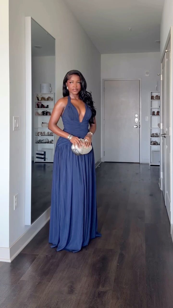
I have worn it to a black-tie dinner with diamonds and to a backyard cocktail wedding with tan sandals, and both times it looked deliberate rather than underdressed.
A halter cut opens the neckline enough to keep the darkness from swallowing you. A silver clutch lifts it; gold competes in a way I do not like.
What I appreciate is the insurance. If the dress code turns out stricter than the invitation suggested, you are covered.
If it loosens up, you still fit. That flexibility matters when I am packing for a Friday evening ceremony and a Saturday brunch wedding in the same trip.
5. Charcoal Grey
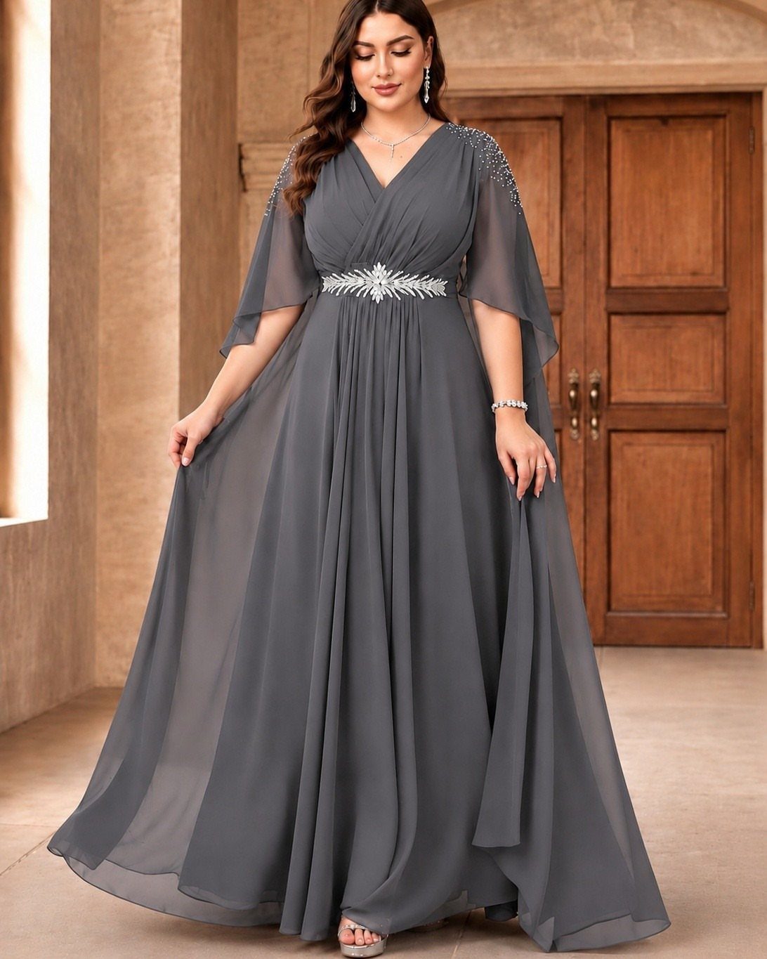
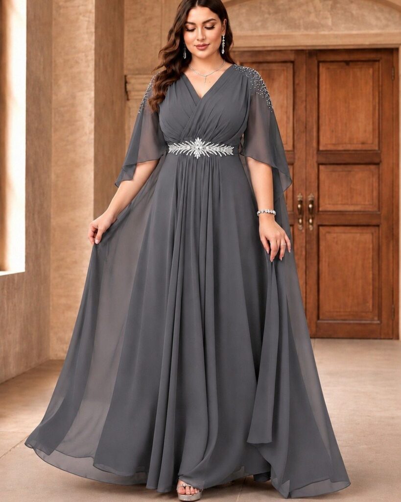
Charcoal grey steps in where black would feel too severe or too safe. The absence of blue undertones keeps it from shifting toward steel in photographs; it stays warm and dimensional under chandeliers or string lights.
Chiffon with silver embellishment catches the artificial light that sinks other colors.
I have seen this work in hotel ballrooms where the uplighting turns everything magenta by late evening. The grey absorbs without disappearing.
Beaded shoulders or a capelet sleeve add structure that the color itself does not provide.
I would keep jewelry minimal, let the fabric detail handle the interest, and choose a lip color with enough warmth that the whole look does not turn ashen.
6. Olive Green Wedding Guest Dress
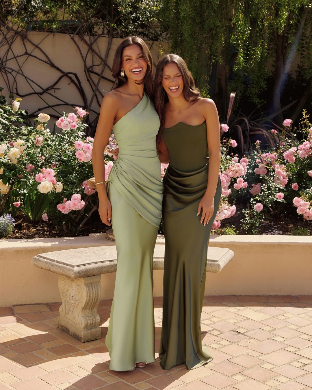
Olive green carries more saturation than the pale sage you see more often, which makes it readable at daytime weddings where a softer green would wash out in the natural light.
Olive holds its own against sage without looking like a costume choice when 2 friends stand together.
I check the undertone against my skin in daylight before buying.
Some olives pull yellow, others drift toward brown; the wrong version drains rather than warms. Satin in this shade reads formal enough for an evening reception but does not feel like overdressing for an afternoon ceremony.
Fall weddings with outdoor transitions are where I would wear this. It belongs in the same palette as turning leaves without matching them directly.
7. Dusty Lavender
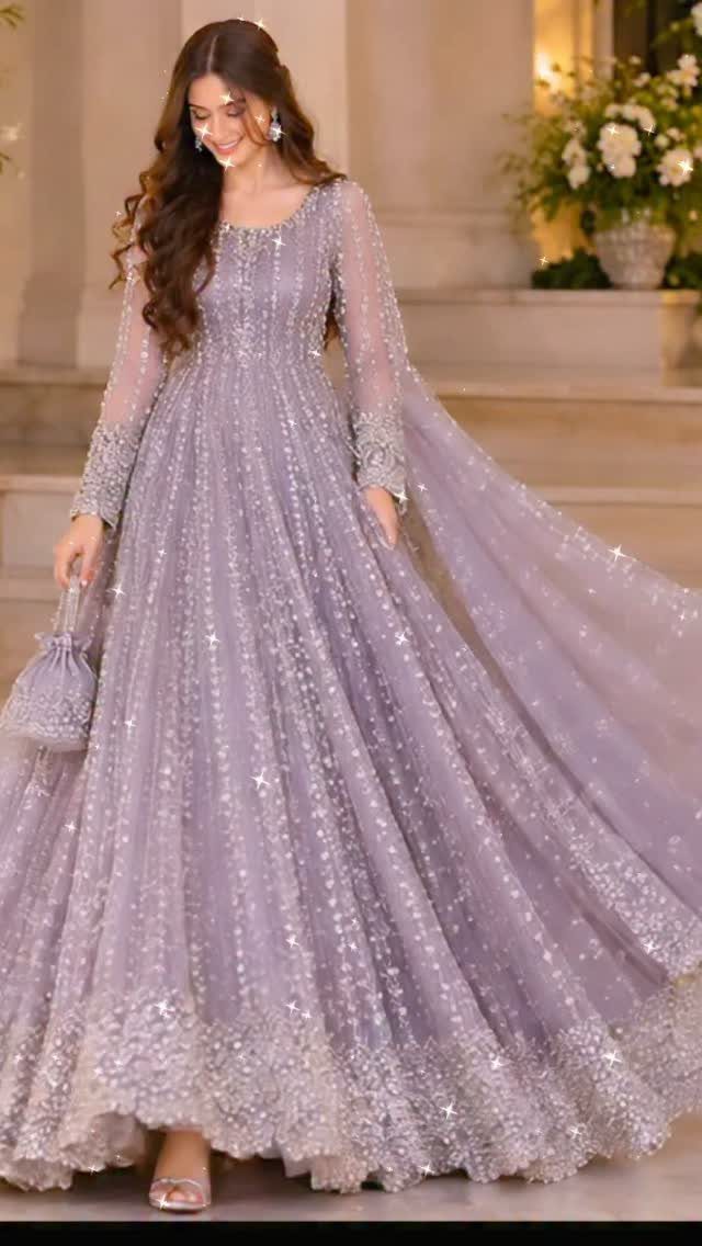
Dusty lavender carries enough grey to read as neutral in candlelight while still registering as color in afternoon sun. The muted tone flatters without demanding attention, which suits garden ceremonies where the setting already competes.
Sequin or beaded versions need little jewelry; a small clutch in the same family finishes it.
I would avoid floral prints or straw accessories here; they push the color toward spring in a way that looks accidental rather than styled.
8. Ice Blue
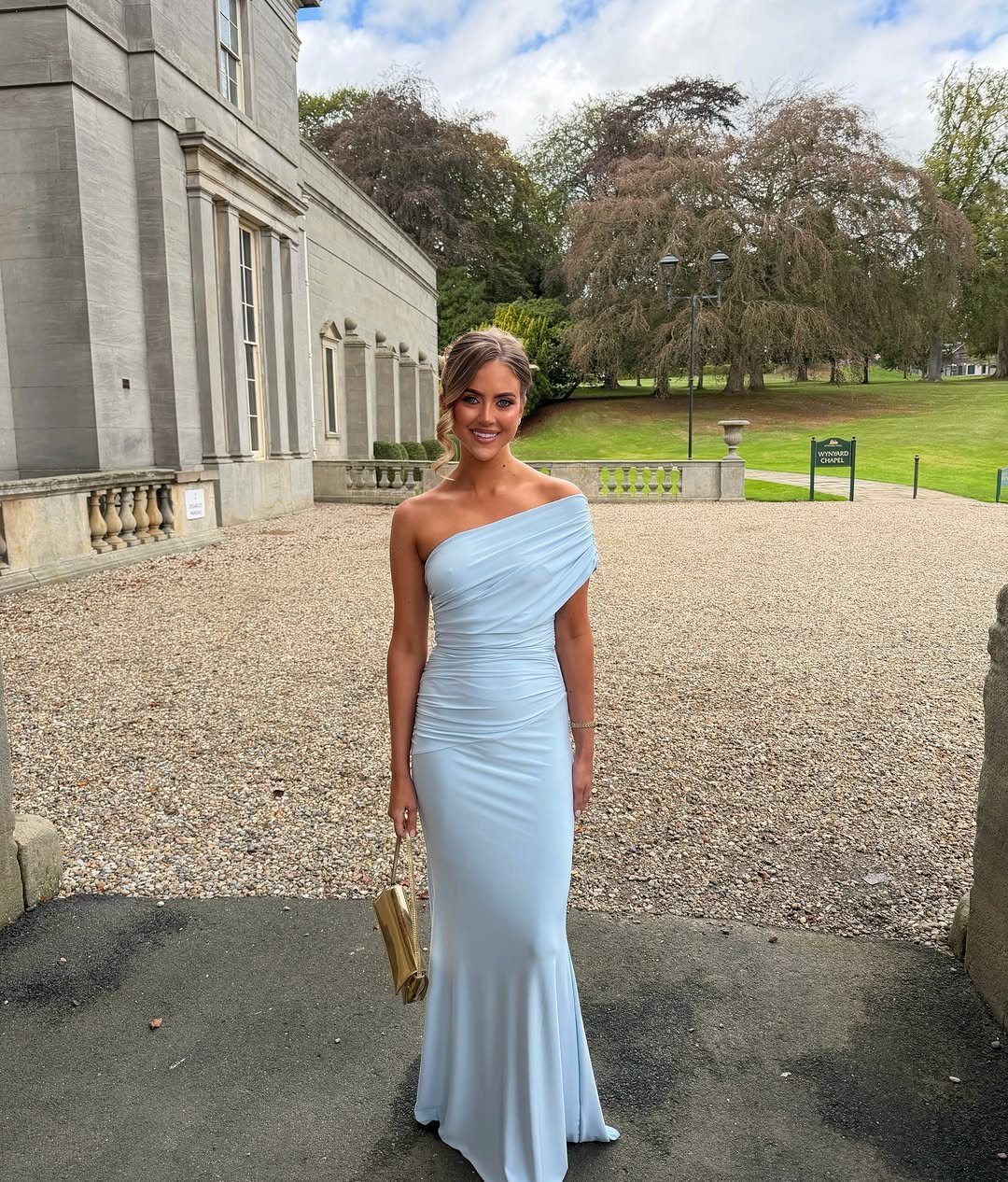
Ice blue works only when the fabric makes the color unmistakably blue, not a white that photographs poorly. Satin or silk gives it the body and sheen that separate it from bridesmaid territory.
A one-shoulder cut keeps the pale tone from going too delicate; structure matters more here than in darker colors. Gold accessories warm it against winter skin, and silver risks a frostiness that flatters no one.
This is a high-risk choice for daytime; the light can wash it out entirely. I would reserve it for evening ceremonies where artificial lighting gives the blue somewhere to land.
9. Gold Metallic Wedding Guest Dress
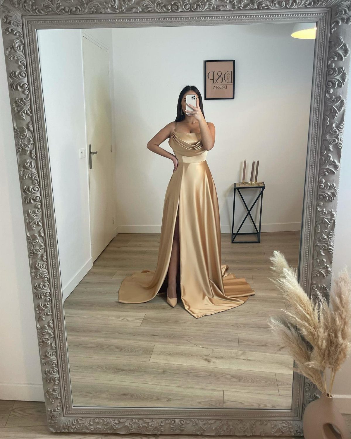
True yellow-gold metallic reads celebration without tipping into costume, but the setting matters. Evening or black-tie weddings give it the darkness it needs; afternoon sun on full metallic can look like a misplaced trophy.
A gold clutch continues the thread rather than breaking it, and strappy metallic sandals finish without adding another competing metal.
Check the bride’s plans before committing. Gold as an accent is common; gold as the whole dress is a choice that needs to be yours alone in the room.
10. Plum Crepe Wedding Guest Dress
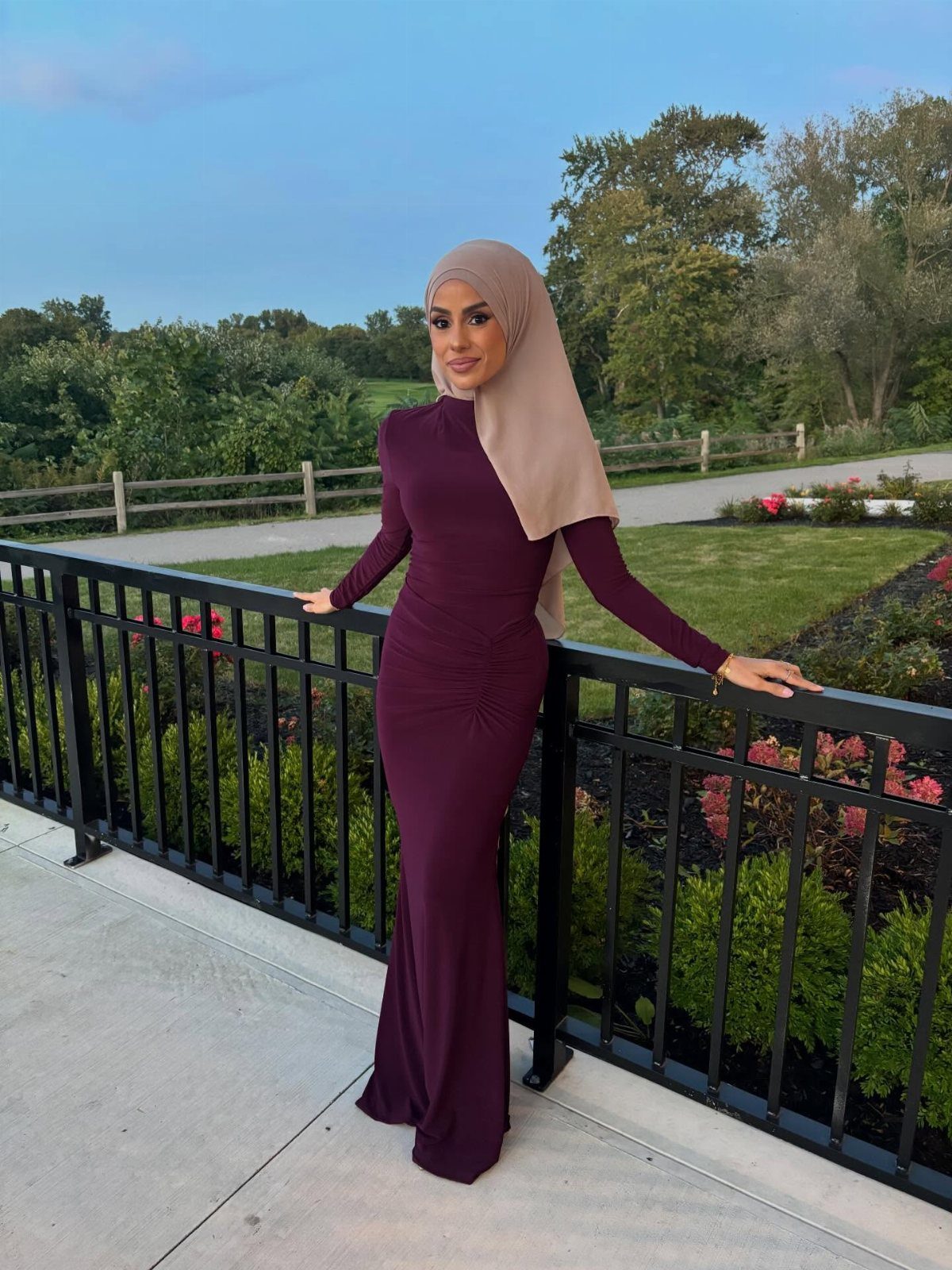
Plum carries the depth of burgundy with a cooler undertone that suits olive and deeper skin tones especially well.
The dusty quality keeps it from veering toward bright purple, which would read as playful in a way most weddings do not invite.
Crepe gives this color the polished surface it needs; the matte finish absorbs light rather than reflecting it back as shine. Long sleeves in plum extend the formality without adding weight, and the fabric resists wrinkling through long receptions.
A neutral wrap or coat in camel or grey extends the palette without competing. This is the color I would choose for a November church wedding where the afternoon ends in early dark.
Frequently Asked Questions
What are the trendy looks for wedding guests in 2026?
Emerald green, sapphire blue, and ruby red are the shades I see most often for winter weddings. Jewel tones hold up under artificial light and early sunset hours, while pastels tend to disappear or turn grey in those conditions.
Pale yellow chiffon reads frozen rather than festive at a December ceremony; save it for spring and summer when the color actually belongs.
What colors are off limits for wedding guests?
Pale colors that resemble bridal white should be avoided, since the bride traditionally holds that shade alone.
Beyond white, pastels often fail in winter wedding photography, turning dull or grey under flash and indoor lighting. Rich, deep tones photograph as expensive and intentional instead.
What are the new wedding guest dress code rules?
Dress codes are loosening, which means more color and style variety is acceptable now than a decade ago.
Midnight navy still works as insurance: it suits black-tie with diamonds or backyard cocktail with tan sandals, so flexibility matters more than ever when a single weekend might hold 2 weddings with different formality levels.