The palettes below range from a two-color combo you can rent by the dozen to a gradient centerpiece that needs roses ordered by shade straight from the grower.
Your venue’s fixed colors, wall to carpet to curtain, matter more than most couples account for: a blush-and-sage scheme against burgundy hotel carpet fights itself, while navy against the same carpet absorbs and quiets.
1. Coral and Teal
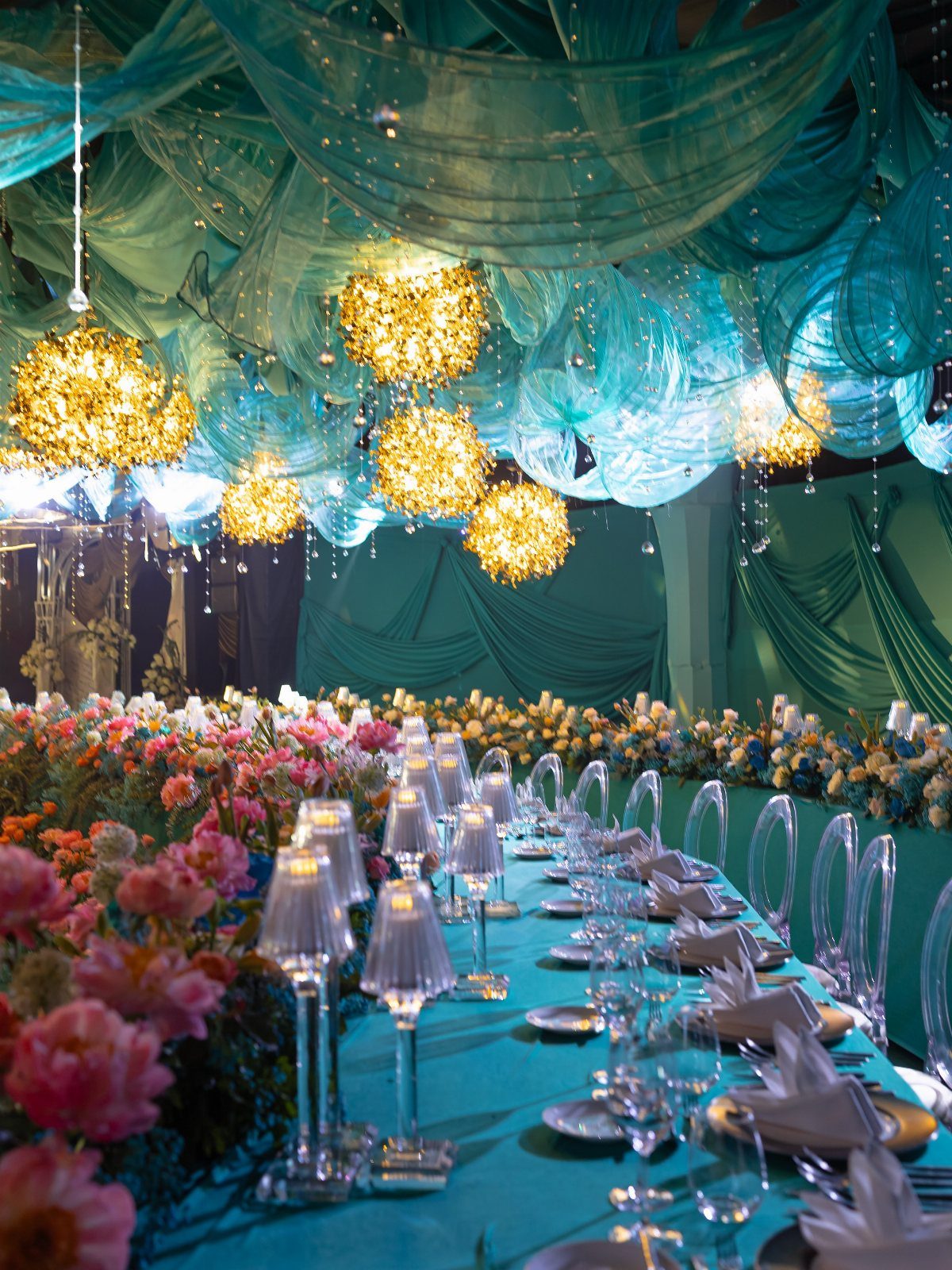
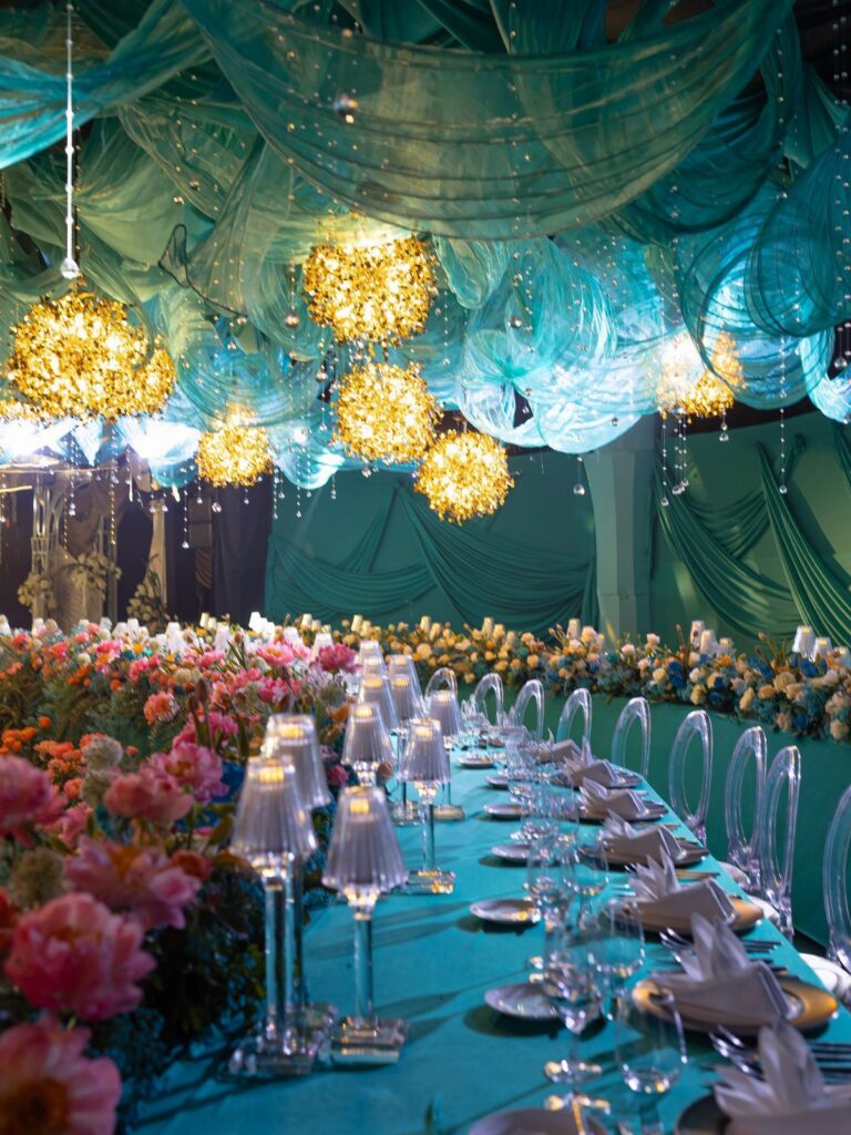
This pairing lives near water. The coral warms up teal’s cool depth so neither color feels like a beach vacation rental on its own.
I would use coral in the flowers and accents, teal in the linens and draping, with gold as the bridge between them.
That division keeps the eye moving without letting either color take over. For rentals, order tablecloths in teal early; it is not a standard stock color at most rental houses.
A petal-strewn aisle works here if you scatter coral and pink blooms rather than sticking to one shade.
2. Navy and Rose Gold
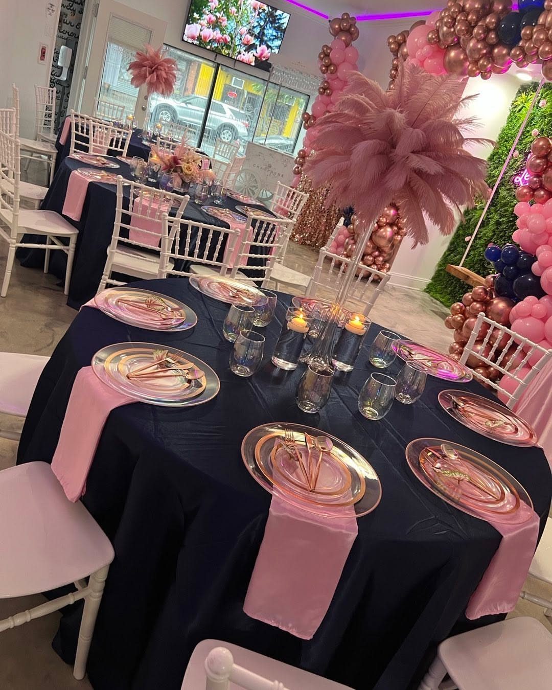
Navy grounds the room while rose gold catches light. The contrast reads as dressed-up rather than decorated, which suits couples who want the venue itself to feel special.
I would put navy on the tablecloths, rose gold in the flatware and candleholders, pink in the napkins to soften the edge. Clear plates keep it from feeling like a corporate event.
Small venues benefit most. The dark tablecloths absorb space visually so the room feels full without extra guests.
3. Blush Pink and Sage Green
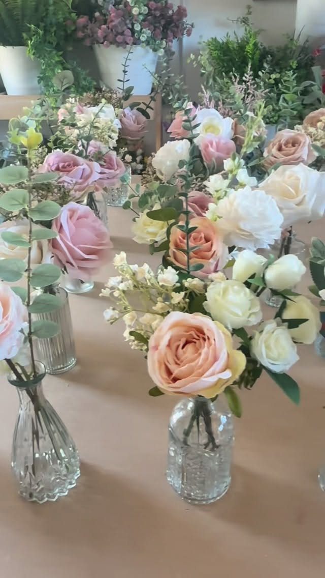
Twenty-four bud vases across a single table sounds like clutter until you see it spaced right. The gamble is proportion: too few and it looks sparse, too many and guests knock them reaching for water.
I would mix 3 flower colors (blush, peach, ivory) plus eucalyptus for the green, all artificial for this look.
Real buds wilt too fast in small water amounts; fake stems let you arrange the week before. The glass stays clear so the table does not feel heavy.
This palette works indoors or out because both colors occur in actual gardens. For a backyard wedding, repeat the eucalyptus in potted plants near the aisle so the tables do not feel like a separate design.
4. Warm Pinks, Purples, and Oranges
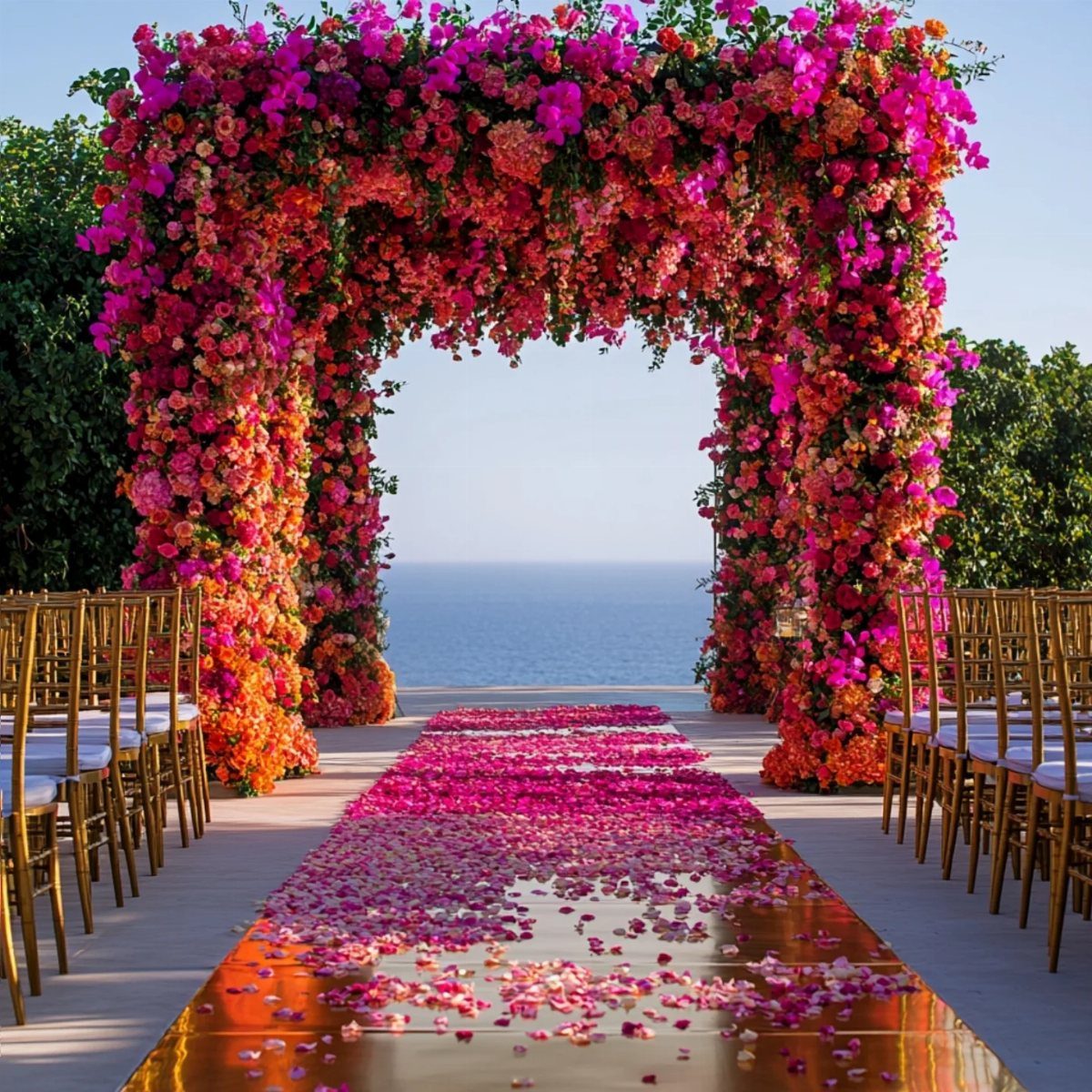
An outdoor arch heavy with these colors frames the couple against sky or water rather than competing with it. The petals on the aisle do half the decorating, so the ceremony space needs little else.
I would carry the warmth into reception tables with amber glassware or candlelight rather than trying to match the exact floral shades.
These colors shift with natural light through the afternoon and evening, so a purple that looked right at setup may read burgundy once the sun drops.
Plan photos and timing together so the palette you chose is the one your camera catches.
5. Soft Pastels with Pops of Color
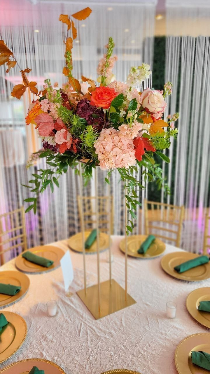
The classic spring palette (blue, pink, green, lavender) stays fresh when one table element refuses to behave. Dark green napkins against pink flowers and gold chargers keep the palette from going too sweet.
I would choose the pop based on what the venue offers. A garden with early rhododendrons suggests burgundy; a city loft, charcoal or rust.
The pop color should appear twice minimum, once in the centerpiece and once in a napkin or charger, so it reads as intentional rather than a rental mistake.
Light fabrics for draping and bridesmaid dresses keep the pastel base from looking Easter-egg. Cotton or linen reads cooler than chiffon; the season decides which you want.
6. Ombre and Gradient Schemes
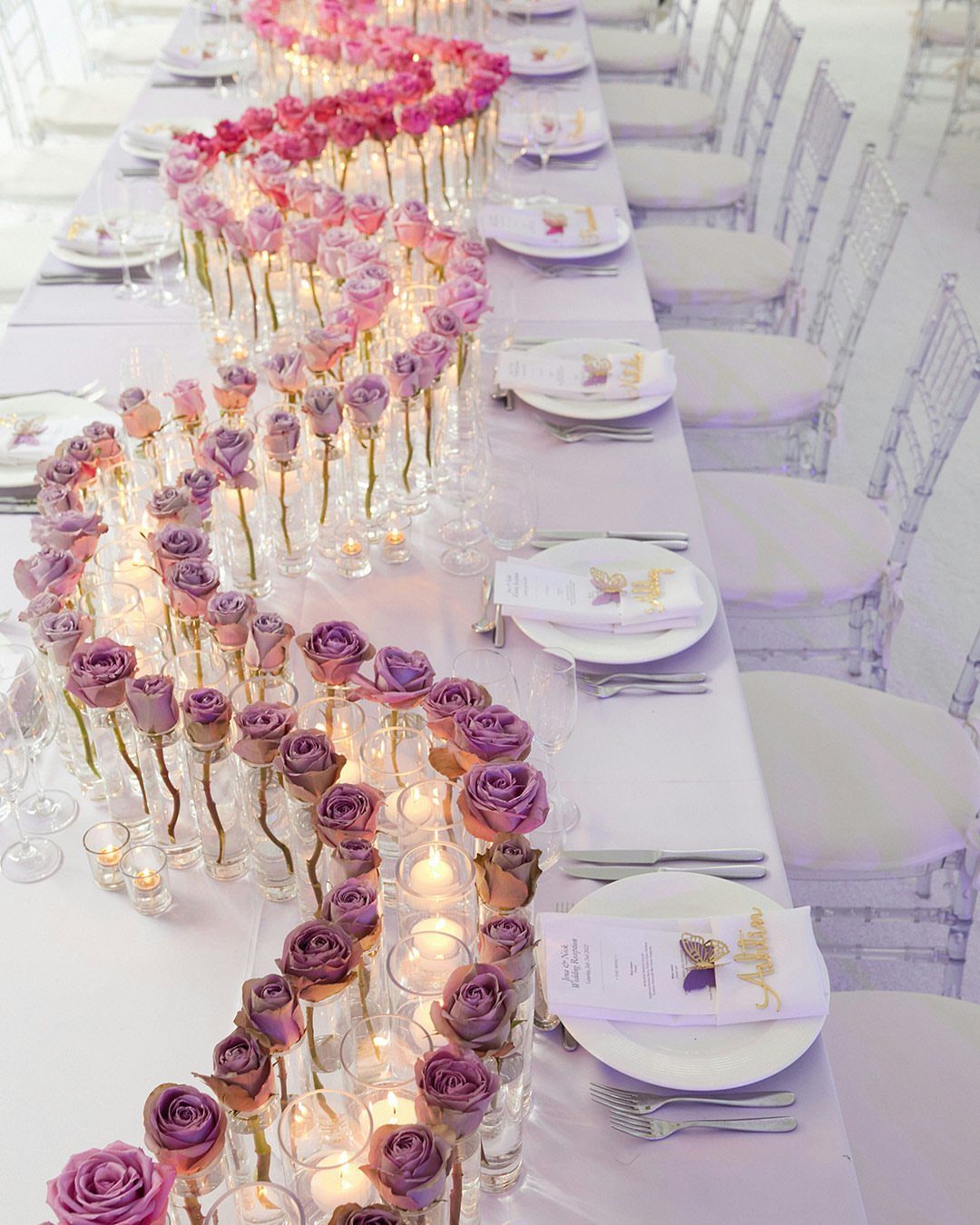
A gradient centerpiece demands planning. The flowers must arrive in distinct shades, then you arrange them color by color along the table before any stems go into holders.
I would order roses in labeled shades straight from the grower; sorting them yourself in hotel lighting is how lavender becomes pink.
A winding runner uses the full table length, so this layout works best on rectangular tables; round tables break the flow into segments. Candles between color bands hide the transition zones where 2 shades meet awkwardly.
This is labor-intensive. Assign the arrangement to one person who starts well before guests arrive, or pay a florist for setup.
7. Forest Green and White
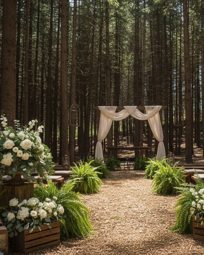
Tall pines do half the decorating for you. White flowers and ivory draping read as intentional contrast against dark bark rather than default wedding colors.
I would keep the wood raw on benches and crates; painted white competes with the florals and loses the forested mood.
Ferns line the aisle well because they tolerate shade, though they wilt within hours without water and struggle in summer heat. Order them for same-day setup.
This palette suits couples who chose the woods for the setting, not the photo. The light drops fast under canopy, so schedule the ceremony earlier than you would in an open field.
8. Navy and Blush Pink
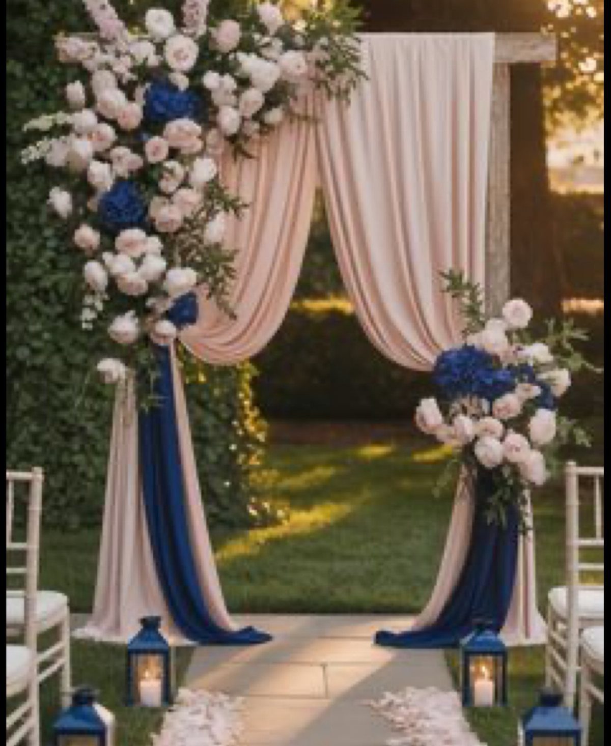
A classic pairing that rental companies stock in quantity, which keeps costs down and backup linens available.
I would use navy on large surfaces (tablecloths, chair sashes) and blush in flowers and bridesmaid dresses, not the reverse.
Blush reads as bare or unfinished when it covers too much area; navy grounds it. Unstained or light oak wood splits the difference between navy and blush without adding another color to manage.
Small venues gain from this pair the same way navy and rose gold do: dark tablecloths fill visual space.
The difference is blush softens the room where rose gold would catch light; choose based on whether your venue has windows worth reflecting.
9. Light Blue and Lemon Yellow
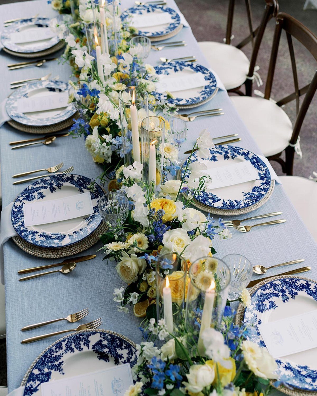
The risk here is nursery. Blue-and-white patterned plates with gold flatware keep it adult by adding formality the colors alone lack.
I would use the yellow at its truest in flowers, nowhere else. Lemon candles, lemon linens, lemon glassware all push toward too much.
One strong dose in the centerpiece carries the whole table. The light blue tablecloth sets the room’s temperature; in afternoon sun it reads cooler, under evening string lights it goes gray, so test your linen in the venue’s actual lighting.
This suits spring and early summer weddings where the colors echo what’s growing outside. For a fall date, swap the lemon to amber and keep the blue.
10. Deep Red and Gold
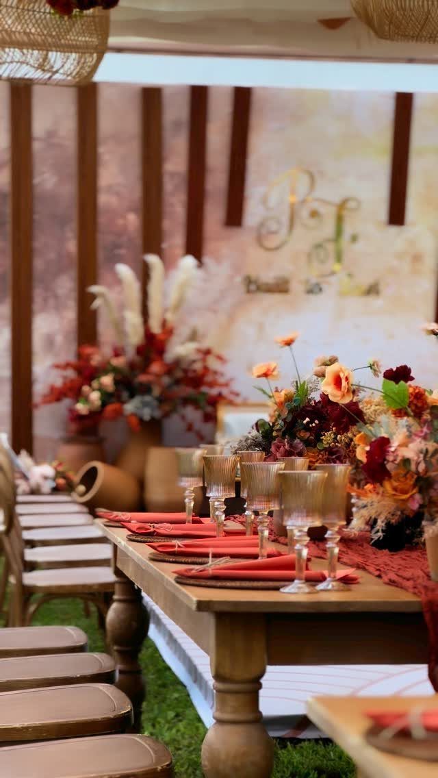
Rich color that photographs well in outdoor light, where indoor bulbs would turn the red muddy and theatrical.
I would use the gold in glassware and flatware, not in fabric or flowers. Metallic gold in centerpieces competes with the red blooms; metallic gold in a glass catches candlelight and drinks it.
Deep red napkins keep their punch when they sit against wood instead of against more red. If your tables are white or pale, switch to burgundy runners instead so the color has somewhere to rest.
This palette demands heavy florals to balance the visual weight. Budget for full centerpieces; sparse arrangements read as forgotten rather than minimal.
11. Gold, Peach, and Blush
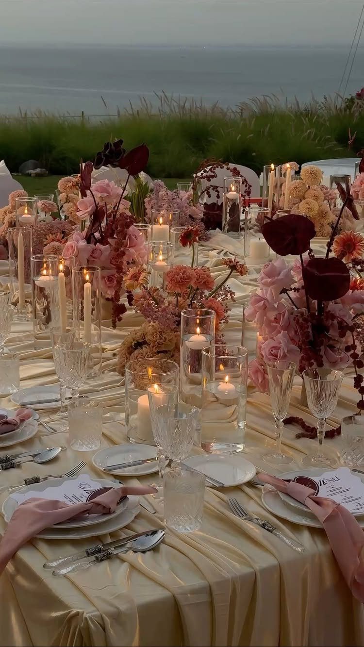
A champagne-gold tablecloth is the statement piece; everything else adjusts to it. Satin catches water and sky best at waterfront or evening receptions, where the shimmer has something real to answer to.
Keep peach and blush in flowers only; they go saccharine fast in linens or glassware. 3 warm colors across every surface blurs together; the eye needs the cool neutral of clear glass and white plate to separate them.
Floating candles in glass cylinders add height without blocking conversation, and they repeat the gold tone at eye level where the tablecloth sits below.
This is formal weight without dark colors. It suits couples who want elegance but not drama, and venues with natural light or water nearby to activate the metallic.
Understanding Color Psychology
Red pulls the eye and raises the pulse, which is why it works for evening receptions where you want the energy to stay high.
Blue does the opposite; it settles the room and slows conversation, better suited to afternoon ceremonies where guests will sit for a while.
Most couples choose one dominant color for the atmosphere they want, then add a second for balance rather than mixing equal parts.
Lighting changes what you chose. Uplighting in your palette color can push the mood further than the flowers alone, but string lights will warm any tone by several degrees.
Test your linen under the actual bulbs the venue uses; a coral that reads lively in daylight turns muddy under cheap LED.
Cultural Significance of Colors
Red at a Chinese wedding carries luck and prosperity, not romance. Guests understand this without explanation, but the couple should know why the color matters so the choice reads as heritage rather than preference.
White in Western ceremonies stands for purity and peace, though modern couples often treat it as default rather than statement.
Gold appears across African wedding traditions as wealth and continuity, a meaning that holds whether the metal shows in fabric, jewelry, or flatware.
Red carries luck in many Asian wedding traditions, while white signals purity in Western ceremonies, and gold stands for prosperity in African heritage; if your background includes one of these, the color can mean more than decoration.
Incorporating Colors Throughout the Wedding
Invitations set the expectation; they are the first place guests meet your palette and the standard against which they will judge everything that follows.
Carry the same tones into the program, the menu cards, and any signage so the eye does not reset at each new object.
Attire is where most couples stop thinking. Bridesmaid dresses in the palette are obvious, but the groom’s tie, the mother’s shawl, and the flower girl’s sash all matter for the photographs where they stand together.
Desserts are the last impression; a white cake with colored sugar flowers ties back to the invitation better than a colored cake that competes with the flowers.
The common mistake is adding a third or fourth color to solve a problem the first two created.
If blush and sage feel too soft, deepen one rather than introducing burgundy. Each new color divides attention and multiplies rental orders.
Frequently Asked Questions
What are the best color combinations for a wedding?
Navy and blush, coral and teal, and blush pink with sage green are reliable pairings that rental companies stock well and guests read as intentional rather than default.
The best combination for your specific wedding depends on your venue’s fixed colors, the season’s natural light, and whether you want guests to relax or pay attention.
Ivory and gold also work as a classic choice that photographs cleanly in most lighting.
What are the wedding color themes for 2026?
Nature-inspired neutrals, bold monochromatic schemes, sunset shades, and moody hues are the directions current planning points toward. For neutrals, sandy beiges and soft grays work best when the venue itself has texture worth showing rather than competing against.
What colors are frowned upon at weddings?
Black and white carry different weight depending on who is in the chairs. Black reads as dramatic rather than forbidden at most contemporary weddings, though it can feel corporate if overused.
The real risk is less a specific color and more a palette that fights your venue’s fixed colors or reads as unintended to your guests’ cultural backgrounds.