The palettes below run from moody navy and plum pairings to warm copper and terracotta groupings, and the deciding factor is how much formality your venue already brings.
A dramatic space needs little help from color; a plain barn or tent asks for more saturation to fill it.
1. Navy Blue
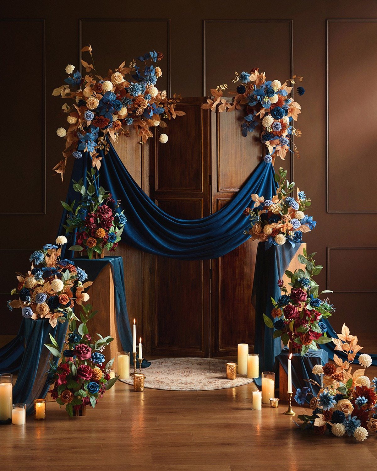
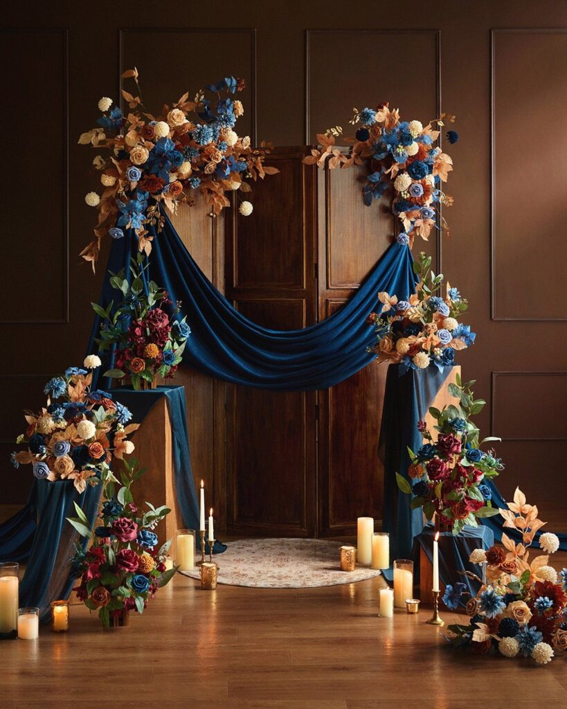
Navy blue holds its own against the rust and burgundy that already surround you in October. I like it for couples who want the formality of a black-tie palette without the harshness of true black.
Gold-rimmed plates and navy place cards carry the color through the tablescape without demanding dyed flowers or hard-to-find linens. The shade works outdoors too; against late-afternoon light and turning leaves, it reads as intentional rather than borrowed from winter.
2. Dusty Rose and Plum
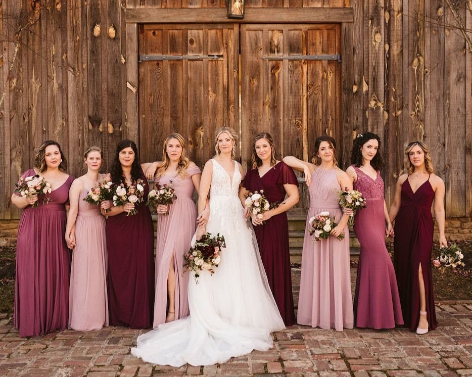
Plum and dusty rose suit the barn venue that drew you to fall in the first place.
The pairing reads vintage without tipping into costume: plum napkins on gold chargers, garden roses and ranunculus with trailing greenery, antique candle holders that you can source from estate sales or your own attic.
I would add the silk ribbon detail to bouquets; it costs little and photographs soft against weathered wood. This palette favors intimate guest lists where the eye travels to texture rather than scale.
3. Gray and Gold
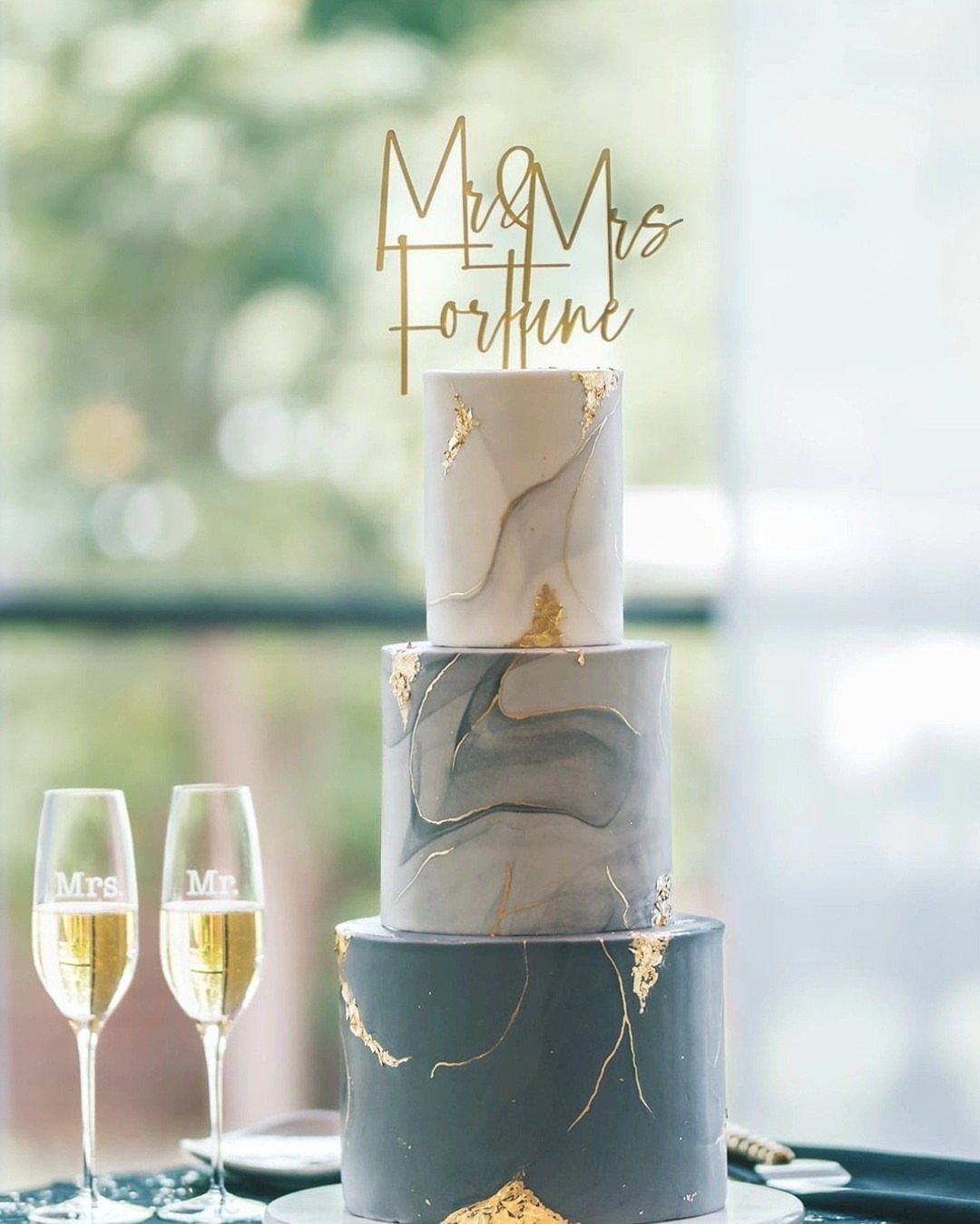
Gray and gold read modern because the combination strips away the expected autumn reds entirely.
I would vary gray between slate linens, dove-gray suits, and any marbled fondant you can find at your bakery. Gold leaf on cake tiers catches reception light better than metallic spray paint on decor, which can read flat.
Silver-rimmed chargers and white blooms complete the look without adding another color. This one suits city venues and clean-lined spaces where rustic reads as out of place.
4. Sage Green and Rust Orange
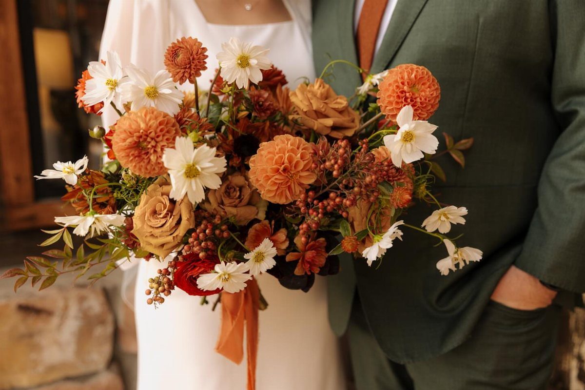
Sage green and rust orange borrow directly from the landscape that surrounds most fall venues. The sage softens what rust alone would make heavy; together they suit couples who want seasonal color without the brightness of true orange.
I have seen this work with eucalyptus garlands down farm tables, rust velvet ribbon on white bouquets, and cream candles to keep the table from going dark.
Meadow green dresses read lighter than forest tones if your bridal party prefers something that photographs airy in afternoon light.
5. Copper, Terracotta, and Cream
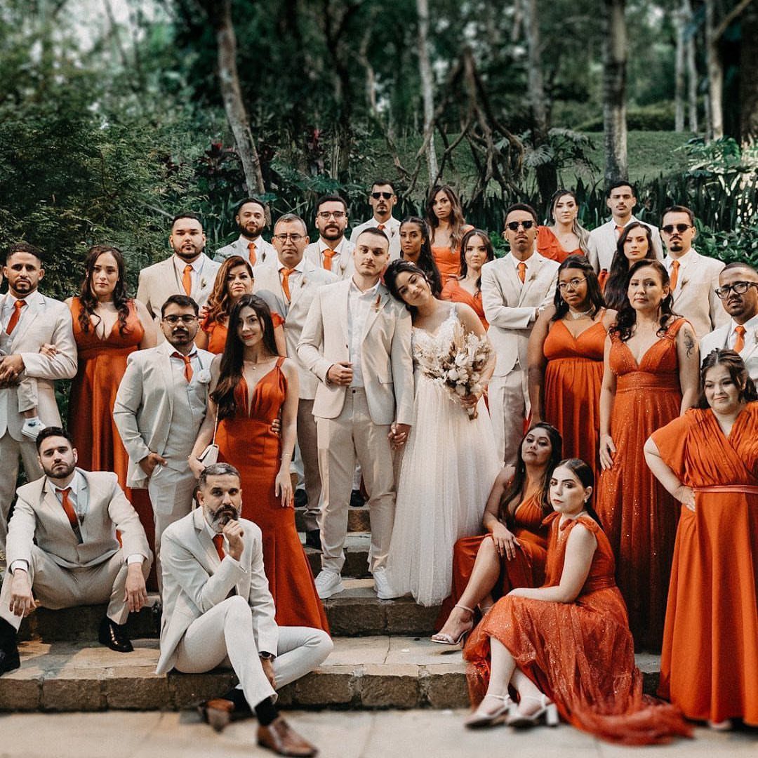
Copper, terracotta, and cream build a palette you can source almost entirely from the season itself.
Terracotta bridesmaid dresses against cream suits photograph warm without the formality of black tie; copper lanterns and metallic candle holders carry the metallic through as actual light sources rather than just trim.
I would use cream linens as the base and let florals do the color work: toffee roses, rust chrysanthemums, greenery that needs no dye.
A draped fabric detail along your head table softens long reception rooms and pulls the eye in so the space feels less like a banquet hall.
6. Mustard, Burnt Orange, and Cream
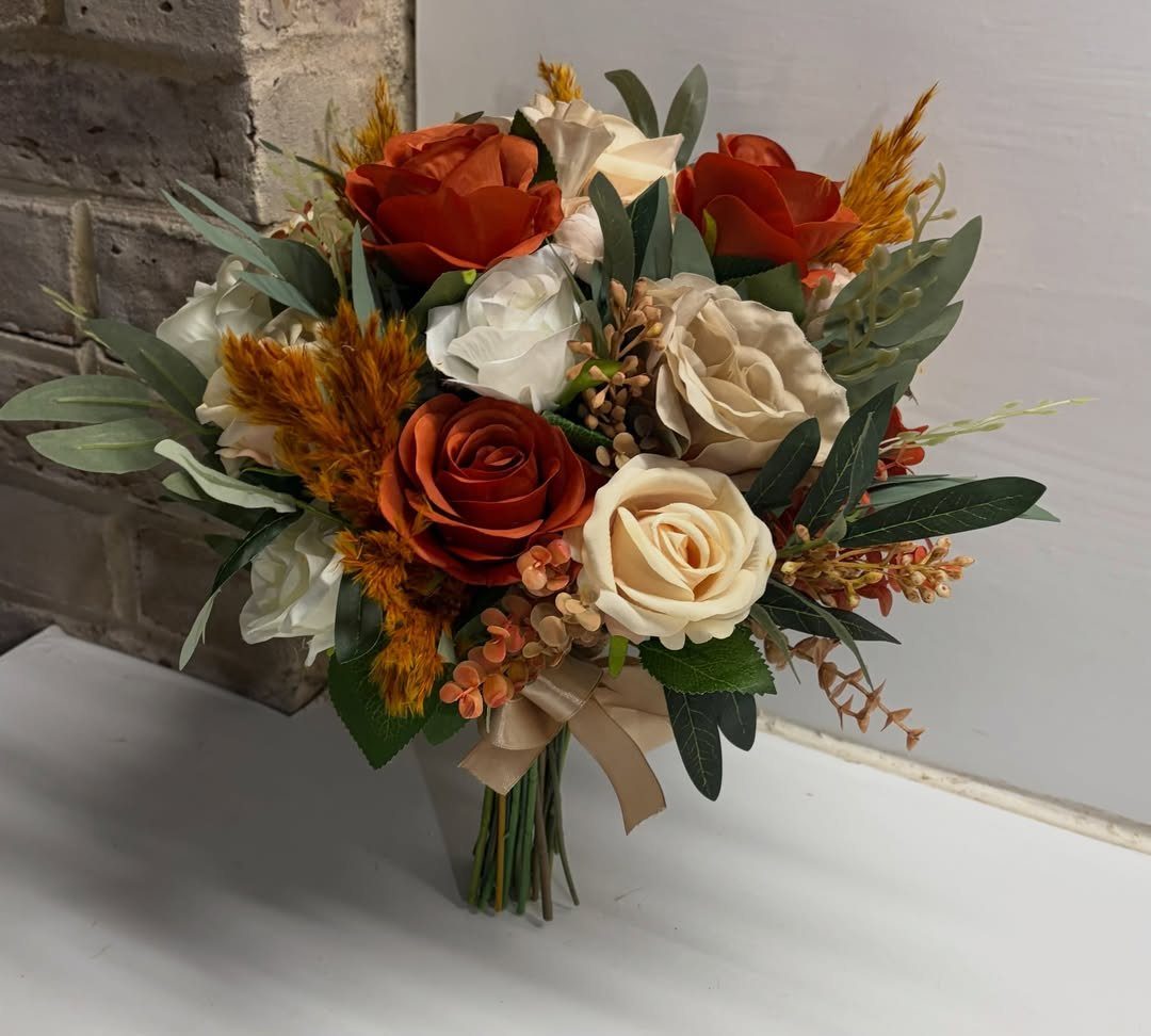
Mustard, burnt orange, and cream pull from the hour before sunset when the light goes golden and horizontal. This palette suits outdoor ceremonies and relaxed timelines where guests move from lawn to tent without a formal cocktail hour.
I would use the colors in layers: mustard lounge seating and rugs in gathering areas, burnt orange dahlias and pampas grass in centerpieces, cream macramé as a ceremony backdrop that travels to the reception.
The dried grass accents in the bouquet add texture that stays fresh-looking longer than fully live stems.
7. Black and White
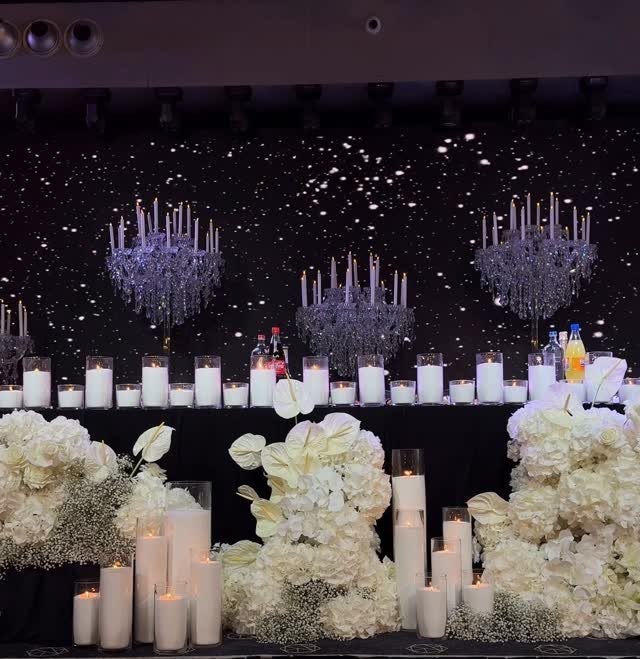
Black and white strips fall wedding color down to its bones: the contrast itself becomes the decoration. I would keep the palette strict rather than softening it with gray; the drama lives in the jump between the two.
Crystal, glass, and mirrored surfaces carry light across black linens without adding another hue. If you want warmth, bring it through candle flame rather than color.
Jewel-toned flowers in small doses work as accents, though I prefer staying monochrome and letting texture do the variation: matte black against glossy, velvet against linen, starlight against solid dark.
This suits couples who already chose a dramatic venue and do not want color competing with architecture.
8. Burgundy, Ivory, and Gold Spaces
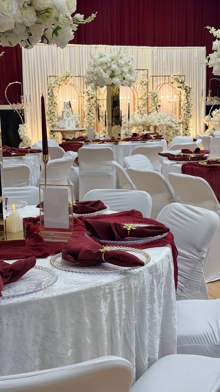
Burgundy carries the weight of fall formality so ivory and gold can stay light against it.
I would use burgundy as the concentrated accent: runner and napkin, bridesmaid gown, the wine itself. Ivory linens and florals keep the table from going heavy, while gold reads as jewelry rather than theme.
Tall centerpieces with red dahlias and white roses give vertical interest in ballrooms with high ceilings; lower arrangements suit vineyard settings where the view already provides the height.
Candlelight matters more here than in most palettes; the glow turns burgundy plush rather than dark.
9. Peach and Green
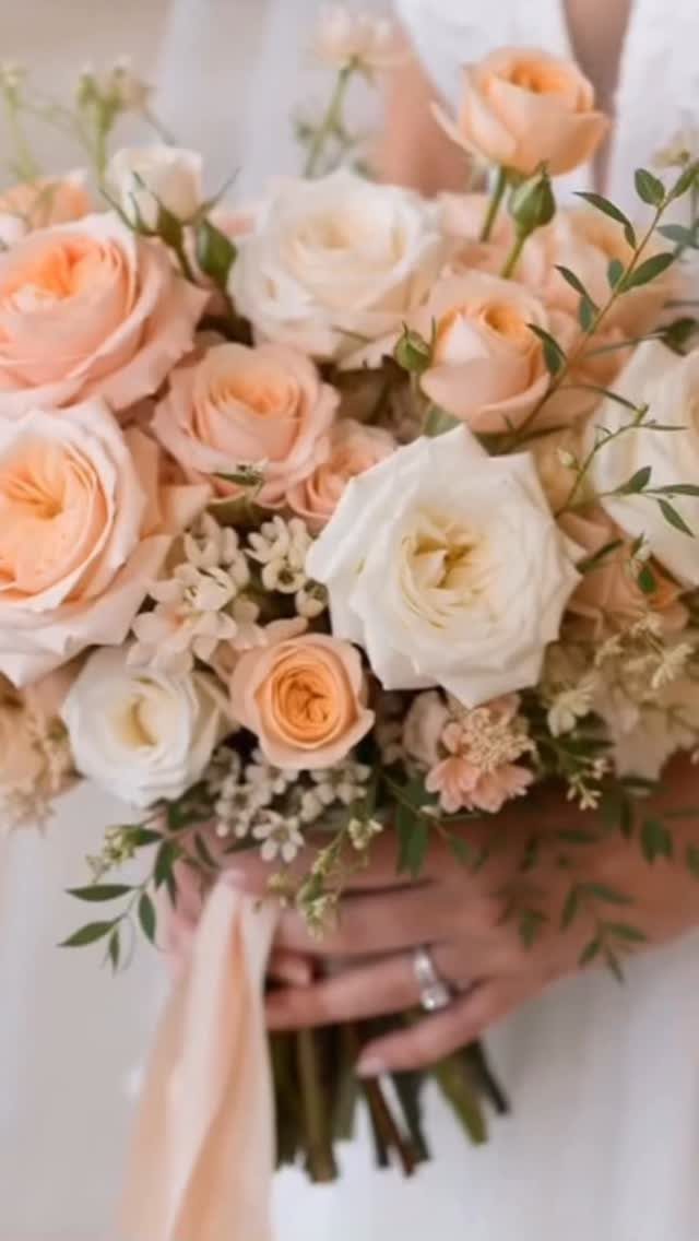
Peach in October reads as a deliberate choice against expectation, not a summer leftover. I would pair it with sage rather than brighter greens; the muted quality keeps it seasonal.
The combination works best outdoors where natural light softens the peach and surrounding foliage echoes the green. Bouquets with peach garden roses and trailing greenery need little else; ribbon in a deeper peach ties the stems without adding hardware.
For boho or garden settings, this palette avoids the rustic clichés that barn venues accumulate. It trades drama for airiness: your guests will remember the feeling more than any single detail.
10. Emerald Green and Gold
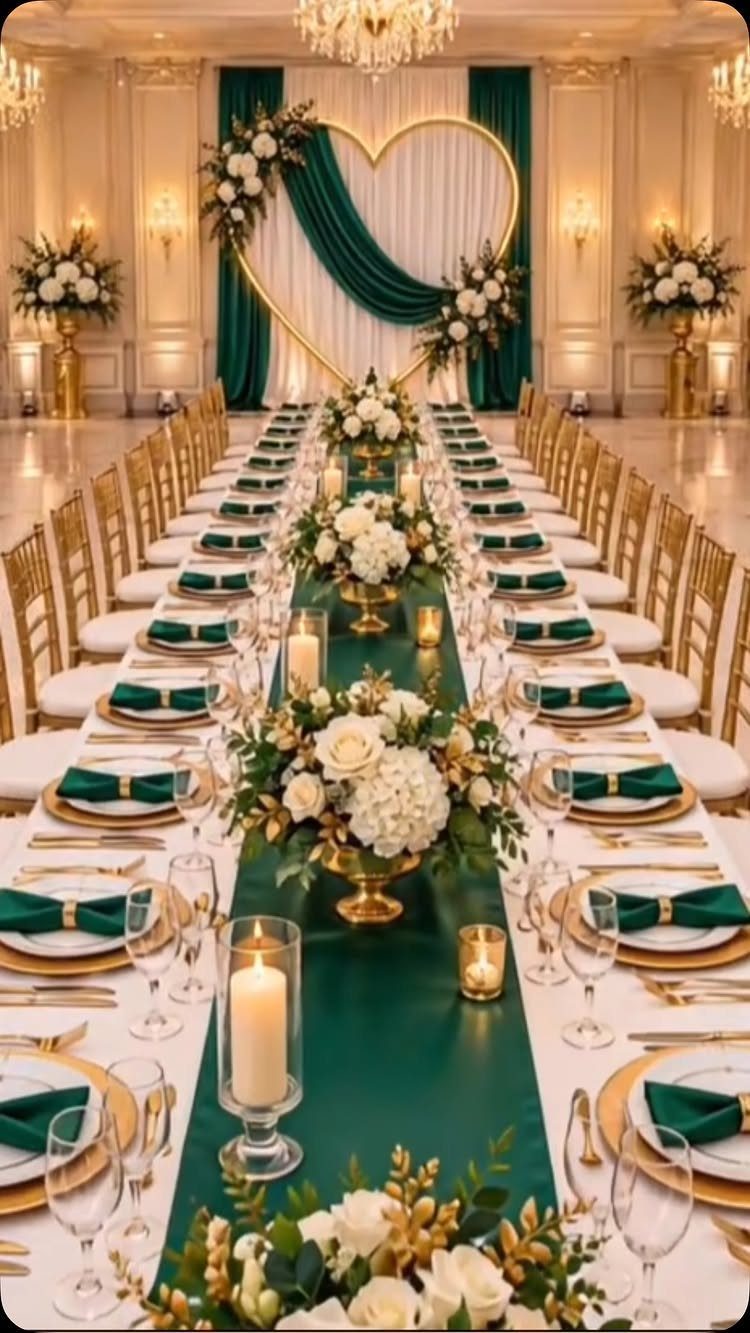
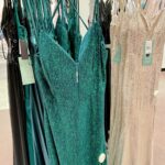
Emerald green and gold carry the jewel-tone formality that navy reaches for but with more saturation.
I would use emerald as the runner and napkin against white or cream base linens; full emerald tablecloths can go dark in rooms without strong natural light.
Gold chargers and flatware frame each place without clutter. The bold move is an emerald fondant cake with gold leaf, though buttercream in white with emerald ribbon is kinder to most bakery budgets.
This palette demands a venue with some gravity; in a plain event space it can look like costume rather than intention.
11. Brown, Tan, and Cream
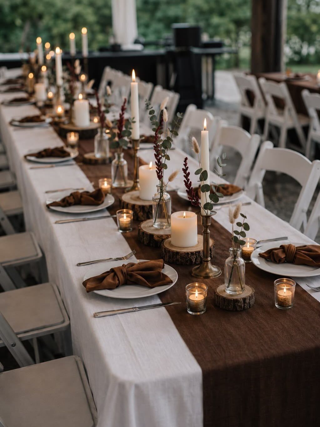
Brown, tan, and cream let the season itself supply the color while you arrange the layers.
I would use cream as the dominant linen, brown as runner and tied napkin, tan in taper candles and wood slice bases. The palette reads rustic without requiring a barn; it softens modern spaces and warms plain ones.
What you save on dyed flowers or specialty rentals you can spend on candle count, which matters here: the glow against brown reads as fireside, and too few sources leave the table flat.
This is the palette for couples who want their guests relaxed more than impressed.
Choosing a Cohesive Palette
Warm and cool tones need to talk to each other across the room so no single table or corner feels like it swallowed all the color.
If your palette runs warm with rust and copper, a cool sage or slate gray in the napkins or runner gives the table somewhere to rest.
Repeat each color in at least one small detail: the ink on menus, the edge of escort cards, a ribbon around favor boxes.
Guests notice cohesion when the burgundy from the bouquet shows up in the cocktail garnish, not because they are looking for it.
Texture carries color further than flat surfaces.
Velvet catches light differently than linen; matte ceramic reads softer than metallic. Mixing them lets you use fewer colors without the room going bare.
Incorporating Fall Elements
Fall blooms do the seasonal work for you.
Dahlias, chrysanthemums, and toffee roses are at their peak in October; they cost less than out-of-season imports and hold up through long reception hours. Eucalyptus and trailing greenery fill space without demanding dyed stems.
Dried grasses last the whole weekend without water, and pampas grass in centerpieces keeps its shape from setup to last dance. I would use them in bouquets alongside live stems; the mix reads intentional, not budget-driven.
Wood slice bases, copper lanterns, and terracotta vessels tie to the season without repeating the rustic barn cliché. The goal is to source from the time of year, not to stage a harvest festival.
Using Neutrals Effectively
Neutrals do the balancing work that lets bold colors read as choice rather than accident. Cream, ivory, and tan soften what burgundy or emerald would otherwise press against the eye; they give the palette room to breathe.
Use neutrals as the dominant base: table linens, suits, larger floral arrangements. To keep a bold fall shade from pooling in one area and going flat, use a neutral like taupe or cream to break it up across your venue.
Gray deserves more credit than it gets.
A slate suit against gold flatware reads modern without coldness; dove-gray linens let metallic candlesticks catch light without competing. Multiple gray tones, from near-white to charcoal, add depth where a single flat shade would go dull.
Brown and cream together read as warmth itself. In rooms with little natural light, this pairing keeps the table from going dark where jewel tones would absorb what light remains.
Frequently Asked Questions
What colors are acceptable for a fall wedding?
Rich and warm colors carry fall weddings without question: burgundy, rust orange, mustard, and brown read as intentional because they mirror what is already happening outside.
Cooler tones like navy, slate gray, and sage green also belong, especially for couples who want the season’s mood without the literal colors of changing leaves.
The palette works when warm and cool tones balance each other, and I repeat each chosen color at least 3 times through the day so the eye reads it as planned rather than scattered.
What to wear to an autumn wedding in 2026?
As a guest, I would look at the couple’s palette and match my tone to theirs without competing. For a burgundy and ivory wedding, a wine-colored midi dress or a chocolate blouse with matching trousers fits without demanding attention.
Outdoor autumn ceremonies call for closed-toe shoes and a wrap or coat in a neutral that does not fight the seasonal colors; the venue and time of day matter more than the year for dressing appropriately.