The dresses below run from barely-there blush to full black satin, with stops at hand-painted purple and burnt orange along the way.
Which one belongs to you depends on where the light falls when you say your vows: a noon garden turns icy blue harsh, while candlelight after dark makes bold red celebratory rather than jarring.
Krzysztof Atelier proves the point with an oversized bow on hot pink tulle that would read costume indoors and reads playful outside.
1. Hot Pink Wedding Dress
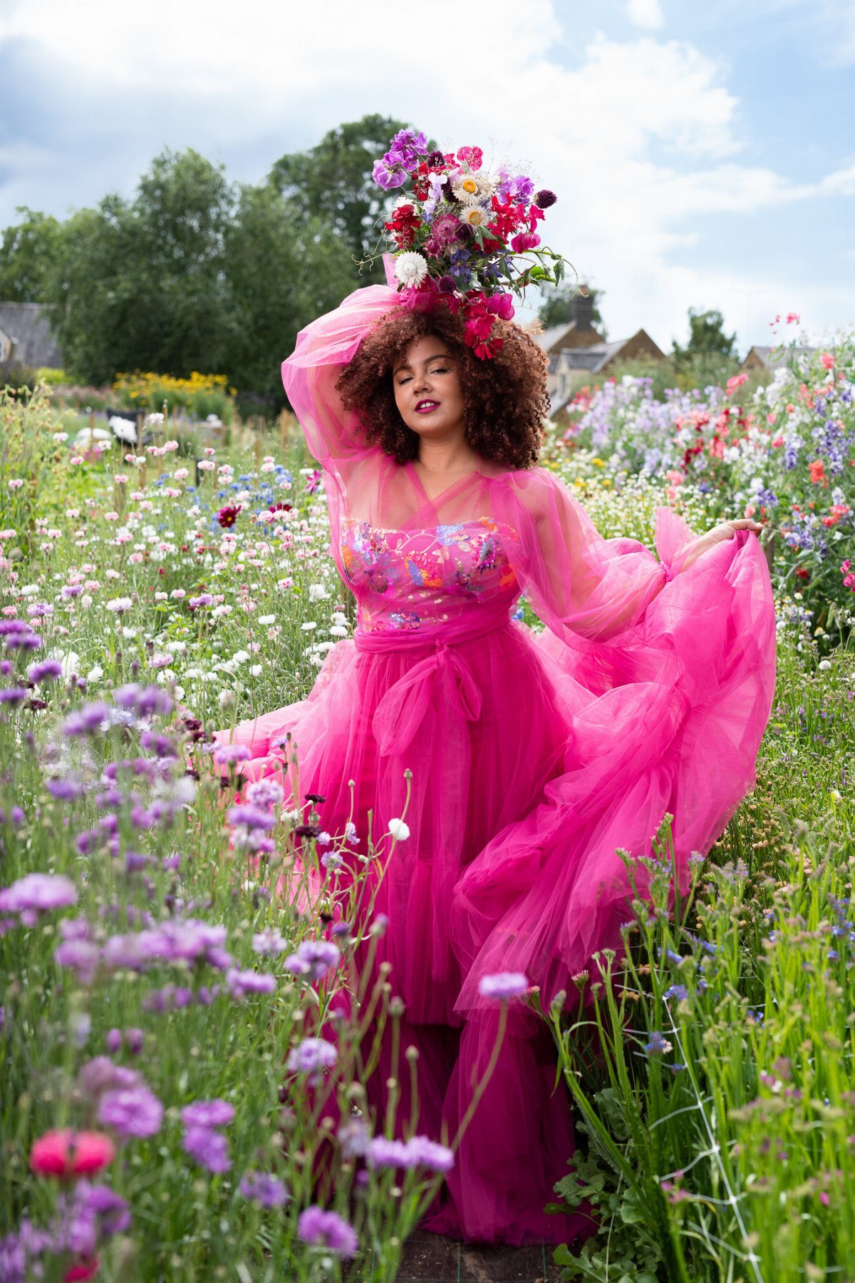
Hot pink tulle stops traffic in a way white never will. The volume in that skirt comes from layered tulle built over a structured bodice, which keeps the silhouette from collapsing into costume territory.
Long sheer sleeves balance the brightness with a little coverage. I would add an oversized bow at the back or shoulder, the way Krzysztof Atelier does it, for the bride who wants playful without tipping into pageant territory.
This color works best outdoors where natural light softens the saturation. Keep jewelry minimal; the dress is doing the talking.
2. Dusty Rose Wedding Gown
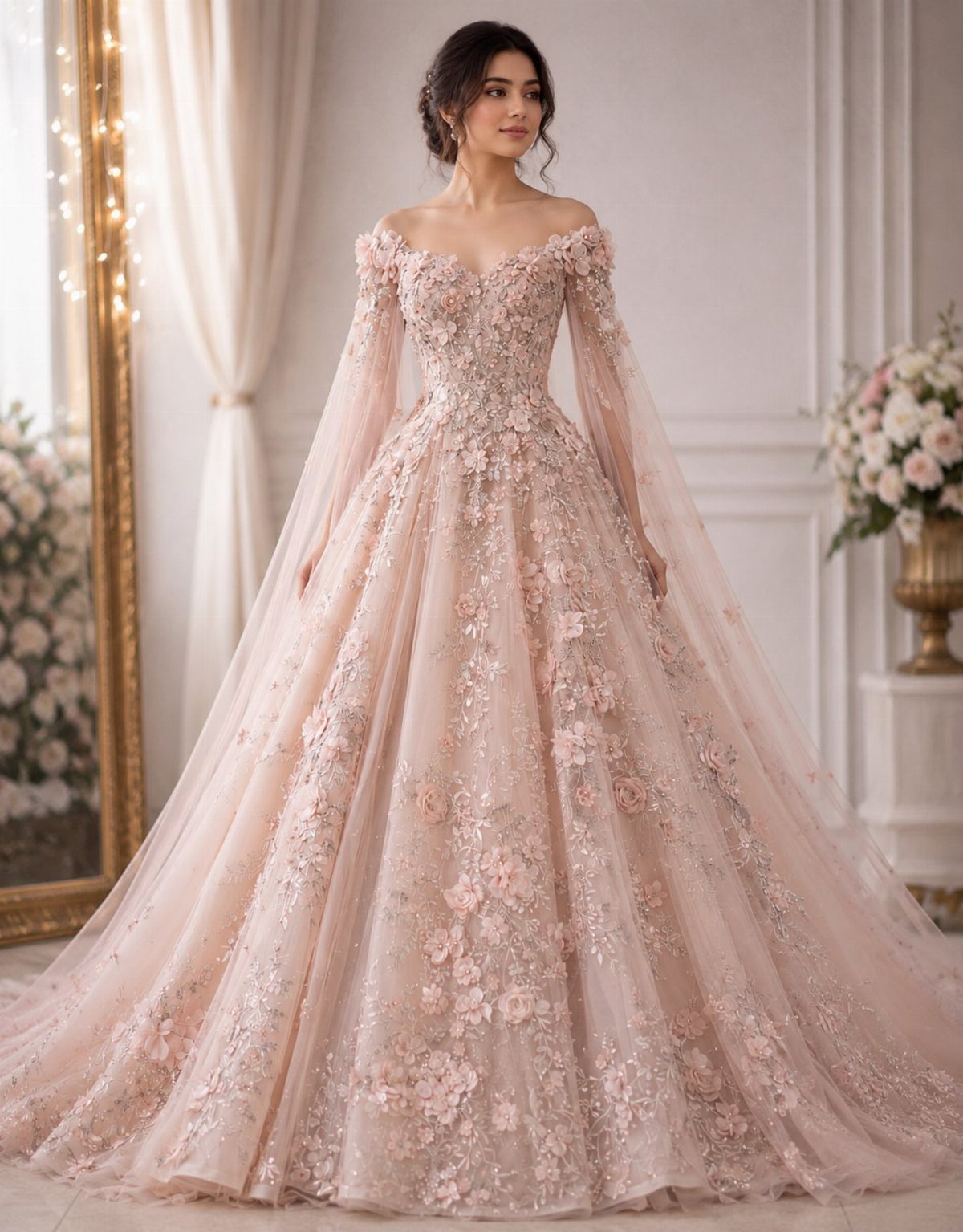
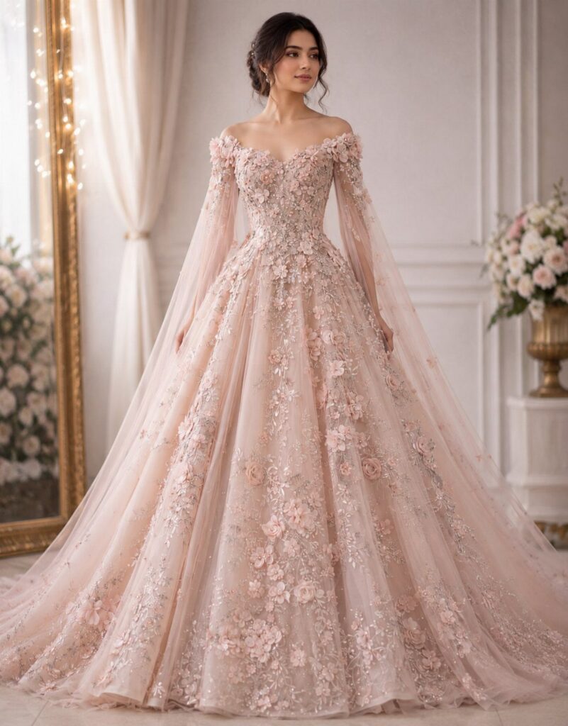
Dusty rose keeps one foot in tradition while stepping away from pure white. The shade reads as romantic rather than shocking, which makes it easier to sell to a mother or grandmother who expected white.
Floral appliqués in deeper or lighter tones add dimension without clutter, and an off-the-shoulder cut pairs naturally with ballgown volume.
For a spring wedding, I would look for organza flowers layered over lace, the way Claire Pettibone builds her pastel gowns, so the color shifts as you move. Sheer sleeves keep the look from feeling too heavy in daylight.
3. Colored Wedding Dresses
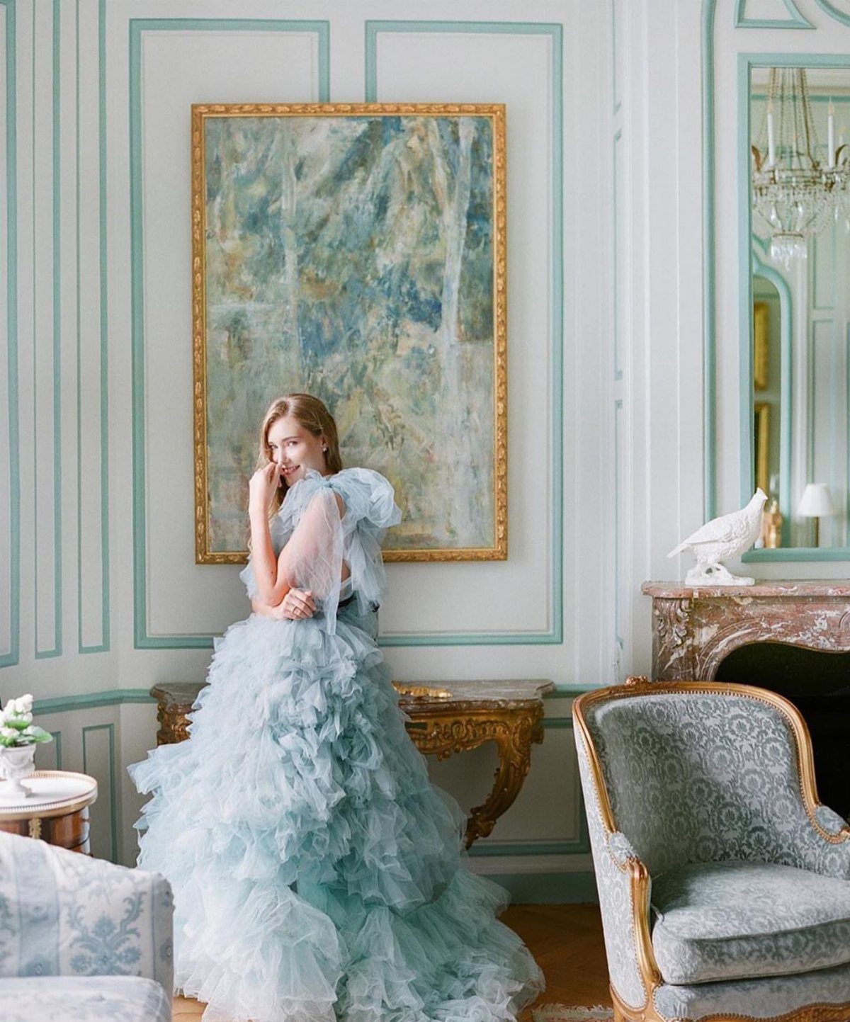
A pale blue ruffle reads as bridal once the shape is right. Match the color to your skin tone: cool undertones handle icy shades, warm undertones need something with a little more depth.
Hold fabric swatches near your face in natural light before committing. This particular gown builds volume through stacked ruffles rather than gathered tulle, which changes how it moves.
Devotion Dresses dyes to order from dozens of fabric-color pairings, though custom work takes time and delivery adds to the wait. Need it faster?
4. Blush Wedding Dress
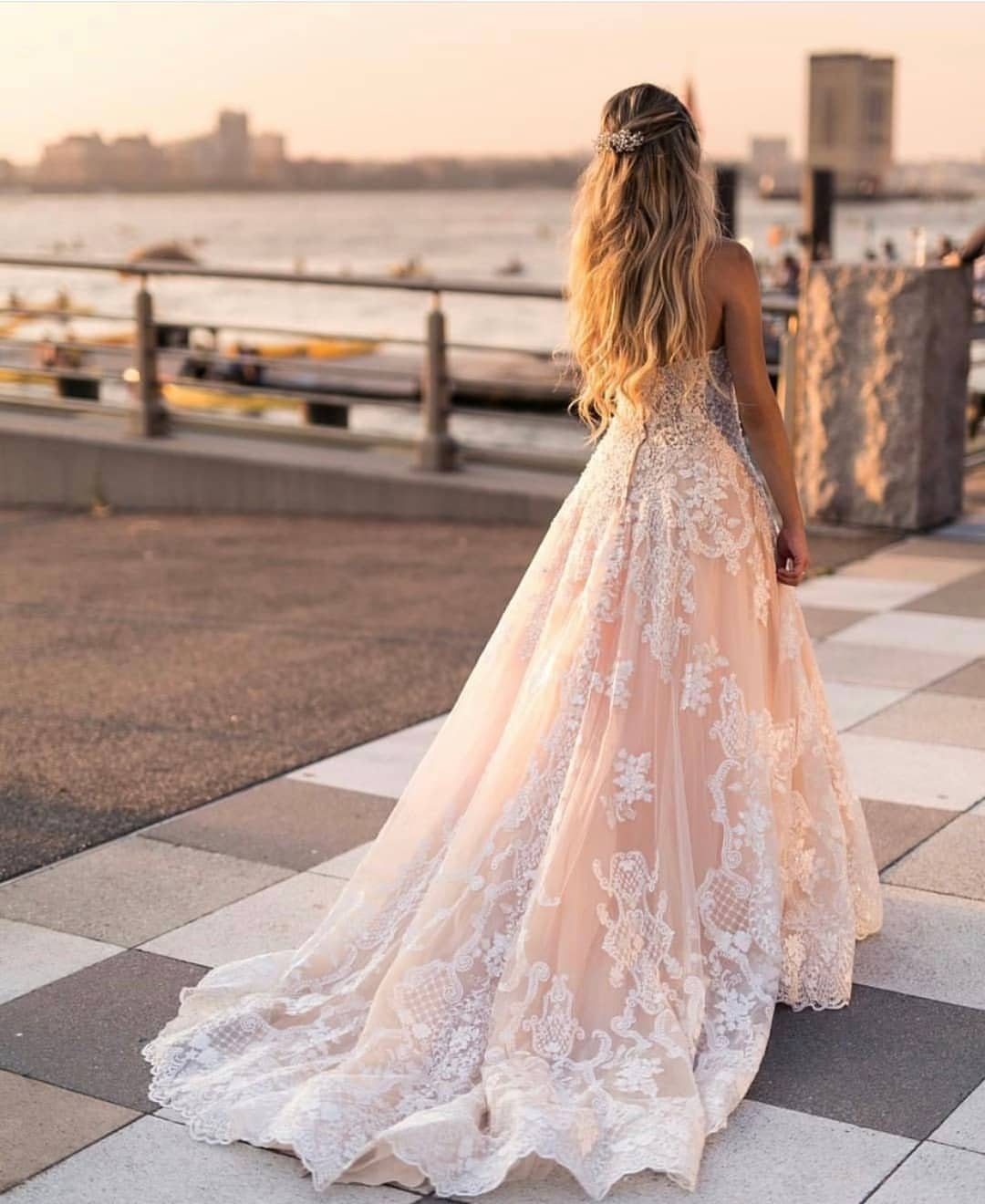
Blush is the gateway drug to color for brides who panic at anything too far from white.
One designer’s blush runs peach, another’s runs mauve, and the difference shows in photos. Order swatches from any label you are considering, then compare them side by side in the light where you will marry.
Lace embroidery in ivory or white keeps the dress reading as bridal while the undertone warms the whole look. Train length matters more in blush; a short train can look like a missed white dress rather than an intentional choice.
5. Floral Embroidery Wedding Dress
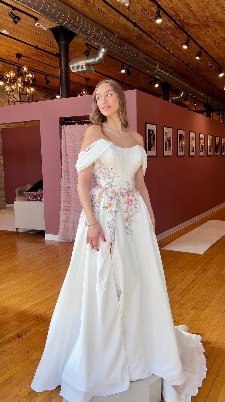
Floral embroidery turns a white gown into something that photographs like a painting. The key placement runs from bodice through waist, drawing the eye upward and cinching the silhouette visually.
What to check before trying: whether the embroidery sits on top of the fabric or is stitched through, which changes how the dress feels against your skin.
Sheer bodices need the right underlayer; hold your hand behind the sample to see how much shows through. Cape sleeves are a separate piece you can add or skip, depending on how much drama the ceremony location can handle.
6. Black Wedding Dresses
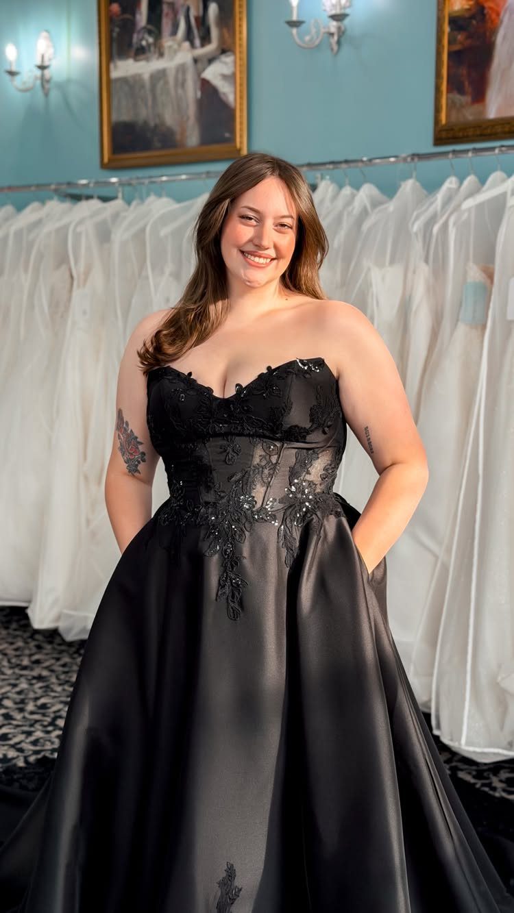
Black satin with lace corset detailing reads as gothic romance rather than funeral wear.
The strapless cut keeps it from feeling too heavy, and the sheen of satin catches light in a way matte fabrics do not. Colorful embroidery over black would soften the look for a bride who wants edge without severity.
Rachel Gilbert’s Frey Gown takes this route in a sleek column silhouette. I would wear this for an evening wedding with candlelight; black reads as sophisticated after dark and slightly confusing at a noon garden ceremony.
7. Burnt Orange Wedding Dress
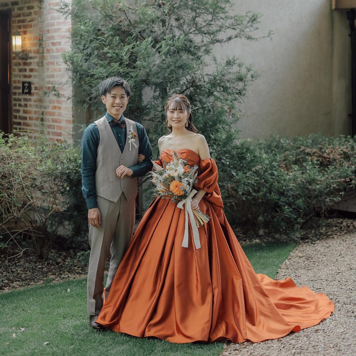
Burnt orange satin carries the warmth of late-afternoon light into the dress itself.
The color belongs to autumn the way blush belongs to spring, though a bride set on it can wear it any season if she builds the rest of the day around that warmth.
I would look for a heavy duchess satin that holds structure in the skirt, since lighter fabrics risk reading as costume rather than intentional.
A full cut gives the volume here without crinoline underneath, so the silhouette stays modern rather than costume. Pair it with greenery-heavy bouquets; white flowers can look bleached against this depth of color.
8. Purple Dip Dye Ombre Dress
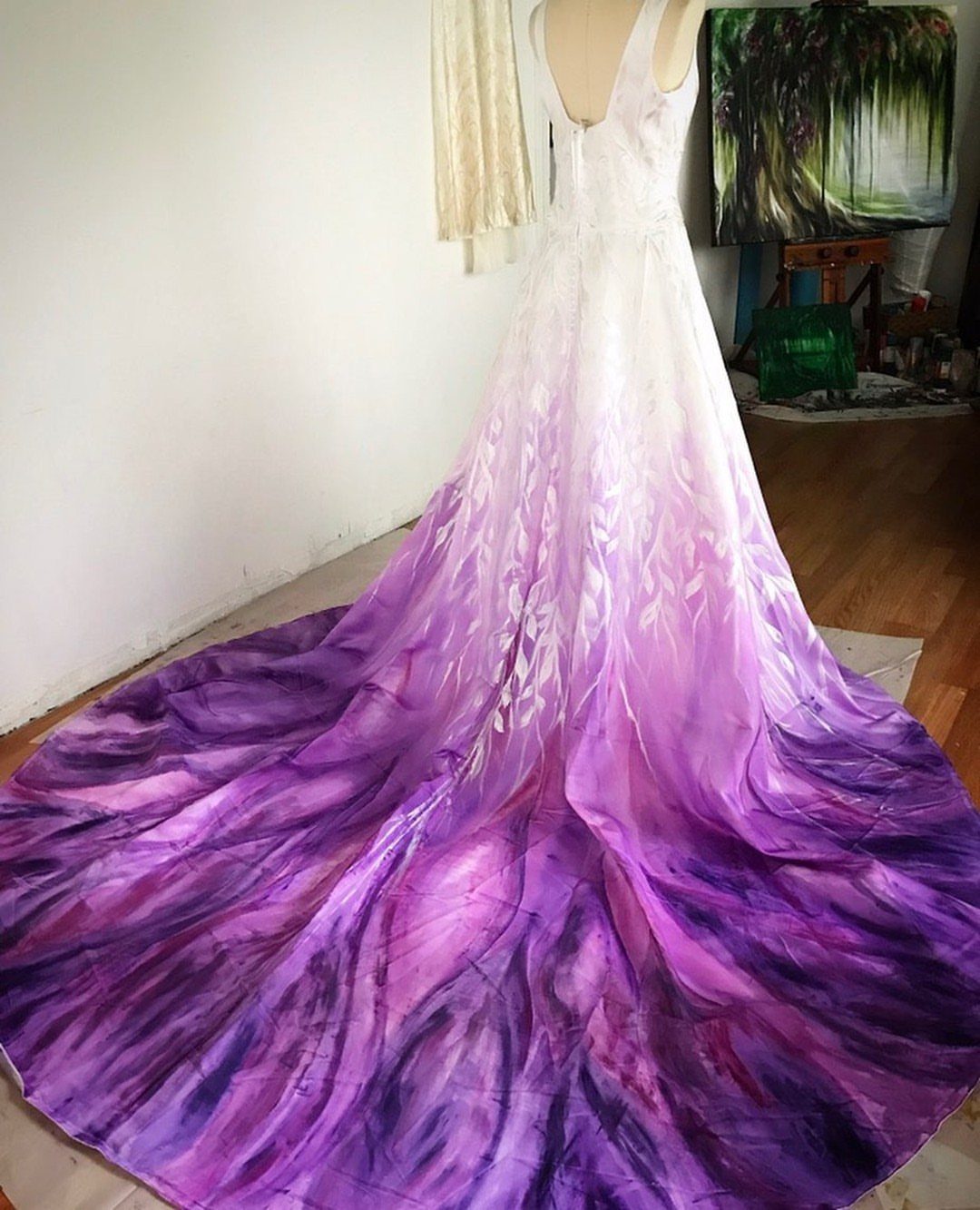
A hand-painted train turns a white gown into something no factory replicates. The technique visible here is brushwork applied directly to fabric, which means each dress varies and the purple bleeds organically rather than in hard bands.
Before commissioning this, ask whether the paint sits on the surface or soaks into fibers; surface paint stiffens and can crack when the train drags.
The finished piece needs a display moment, stairs or a long aisle, to show the full gradation. I would keep the bodice plain white and let the drama stay below the waist where movement happens.
9. Bold Red Wedding Dress
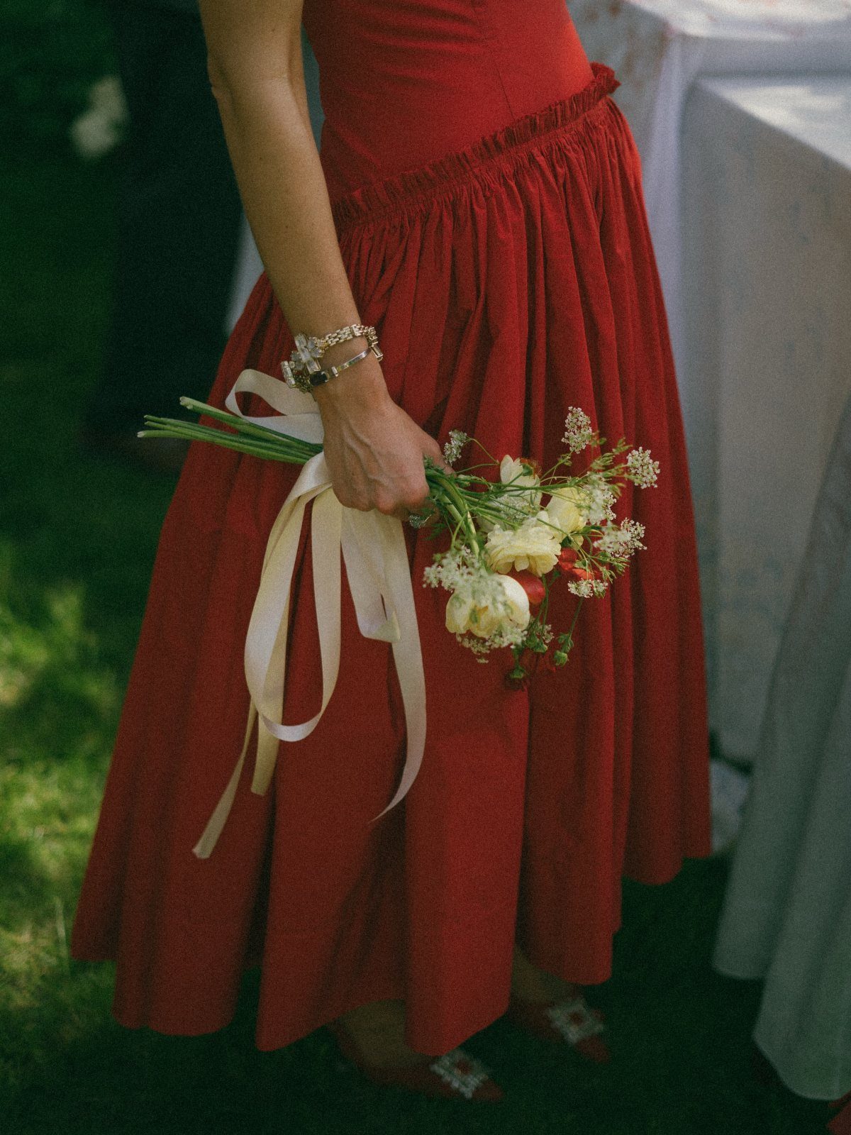
Red makes the bride the punctuation mark in her own day.
The midi length keeps it from reading like a gala gown that wandered into the wrong event, and the cream ribbon trailing from the bouquet softens the contrast instead of fighting red with stark white.
Check your venue’s formality: red reads as celebratory in a city hall or at an evening reception, but can feel jarring in a traditional chapel.
Sequin versions catch light beautifully after dark; matte crepe or satin suits daylight better. I would add the trailing ribbons to whatever bouquet I carried, the way this bride does.
10. Pastel Floral Print Gown
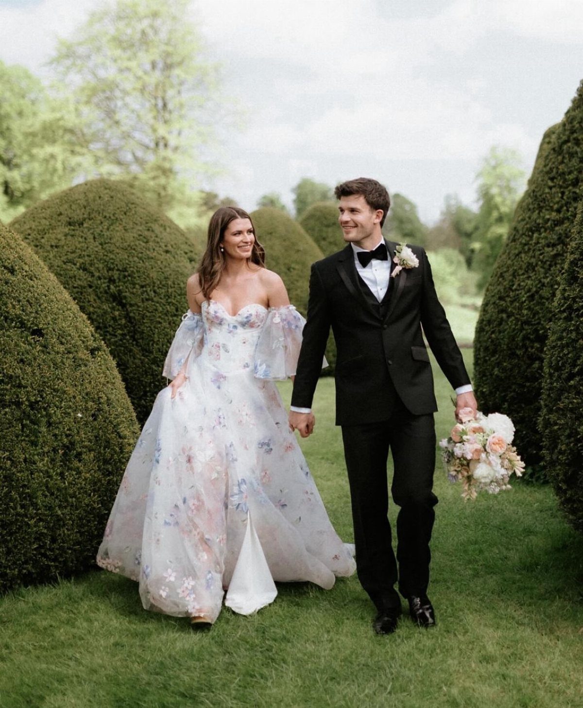
A printed floral lets the dress carry the decoration so nothing else needs to. The watercolor-style blooms here sit on an off-the-shoulder cut with a fitted bodice, which keeps the look structured despite the softness of the pattern.
Puff sleeves or off-the-shoulder both work; sleeveless risks making the print feel like a summer daydress rather than bridal.
The scale of the print matters: large blooms photograph better from a distance, small ones reward close-up shots. I would choose this for a garden or outdoor wedding where real flowers and printed ones can echo each other without competing.
Advice on Dress Color Selection
Skin tone matters more with color than it ever did with white.
Bring a swatch of your bridesmaid color, your table linen, your bouquet ribbon. The dress has to live beside these for hours in photographs.
Venue light changes everything.
A champagne underlay reads as ivory in sunlight and can drop to beige under incandescent bulbs. Ask to see the dress near a window and then in the fitting room’s artificial light before you decide.
Photographic Considerations
The mirror lies. Take a photograph of every dress you try, because color records differently than it appears in person.
A champagne underlay with ivory lace photographs lighter than what you see reflected back. Stark whites blow out detail; softer tones let beading and embroidery read as texture rather than glare.
Hold your hand behind the fabric when you shoot, then look at the result. What registers as subtle in the salon can read as exposed in a digital file.
Evening receptions and candlelight warm every shade.
A burnt orange that glows at 4 pm can turn muddy after dark; a black gown that looked severe at noon becomes sophisticated under chandeliers. If your ceremony and reception fall at different times, photograph the swatch at both hours.
Flash photography flattens color.
Ask the salon to turn on any flash they have, or use your own, so you see what the official shots will catch. The dress you love in soft light may surprise you when the camera pops.
Breaking Tradition
White became bridal convention in the 1840s, which makes it a relatively recent rule to break.
The shift back toward color is not a rebellion against history so much as a return to it; colored wedding dresses appeared for centuries before Victoria’s white gown fixed the standard.
A bride in hot pink or bold red is not keeping quiet about tradition; she is breaking it on purpose, and the photographers at Dancing With Her have the proof in thirty-four real weddings to show it.
She is simply wearing what she prefers, the way a guest would.
The dress still signals bridal through cut, volume, and placement: a train, a veil, the formality of the construction. Color changes the mood, not the category.
Family reaction varies. Dusty rose eases the transition for relatives who expected white; black or purple dip-dye may require a conversation beforehand.
The bride who wants color without conflict can look to blush or champagne, which read as white-adjacent in photographs while satisfying the desire for warmth.
The choice is individual, not ideological.
Some brides wear white for the ceremony and color for the reception; some reverse it. There is no correct progression, only what works for the particular day.
Frequently Asked Questions
What color wedding dress should I wear?
Start with your venue’s light and your skin’s undertone. If your veins look blue, icy blues and silvers will look like they belong on you; olive or gold veins mean richer, deeper colors do the work.
Taping fabric to your bathroom mirror in daylight is the fastest way to see if a shade drains you or gives you life, and that same scrap of fabric in your purse keeps the florist from pairing coral peonies with a blush gown that reads orange.
Pale blue at 2 PM outdoors can look like a medical uniform; by 6 PM it turns into something that moves with the light.
When can I wear a black or brightly colored wedding dress?
Black after sunset looks intentional; black at noon in a garden looks like you might be lost. Red at city hall feels like the right kind of drama; hot pink in open air loses its shout and becomes wearable.
The venue’s formality matters: bold color celebrates in some spaces and jars in others. White against grass or limestone goes flat; a color picks up the green or the gray and gives the camera something to hold onto.